Project date: 2021 June - 2023 February
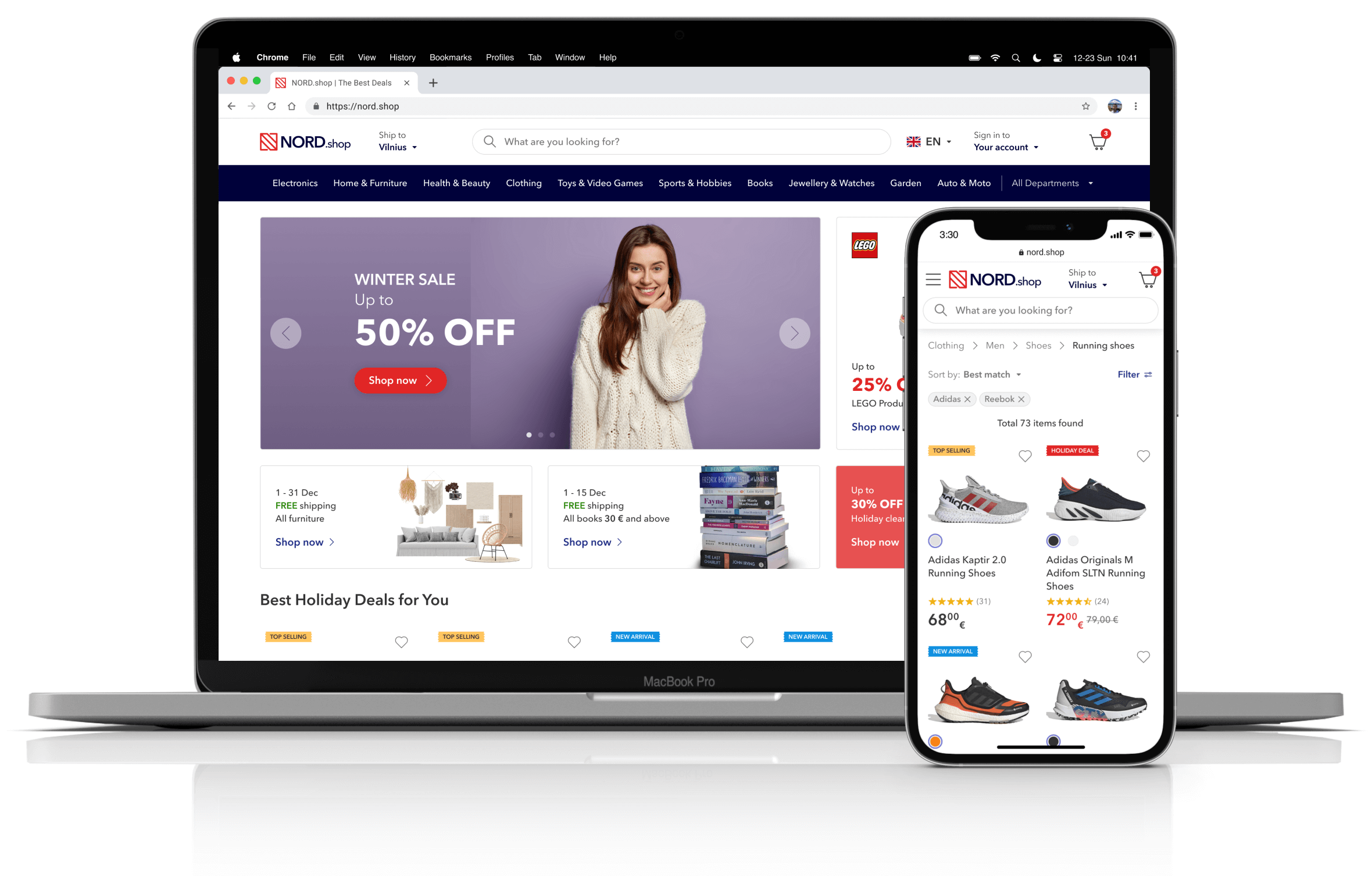
I joined this project as a freelance generalist UX/UI designer, which later pivoted more towards the UX and product sides of things. I provided the client with usability research data and led the rebuilding of the design system and most-visited pages. I also helped establish product design guidelines and a productive workflow, which improved the end product, as well as the collaboration between management, development, and design teams.
My tasks included:
Main challenges:
If I were to guess how this e-commerce project started (which was around 2007), I’d say it was done without the help of a professional designer. Therefore, nearly everything was carried out as the developers and POs chose at the time, and certain aspects have never been changed. This left a massive UX debt that impacts the redesign process painfully because it’s extremely hard to improve one part without touching the others.
Apart from my own access to the research libraries and some analytics that we occasionally received, there were no other UX research tools available.
Upon joining the team, I noticed a divide in attitudes between the management, development, and design teams. A genuine sense of collaboration for the betterment of the end product seemed to be lacking, as each team appeared to prioritize their own agendas. The design team didn't like the chaotic management and sometimes flawed, outdated development methods. The management and development teams didn't trust the decisions made by the design team and always took their advice with a grain of salt.
Disclaimer:
The project identity and some designs are different from the actual product and have been changed to accommodate the NDA with the client. Some parts were not implemented or are yet to be implemented because of massive tech debt. Most usability research data is from the Baymard Institute.
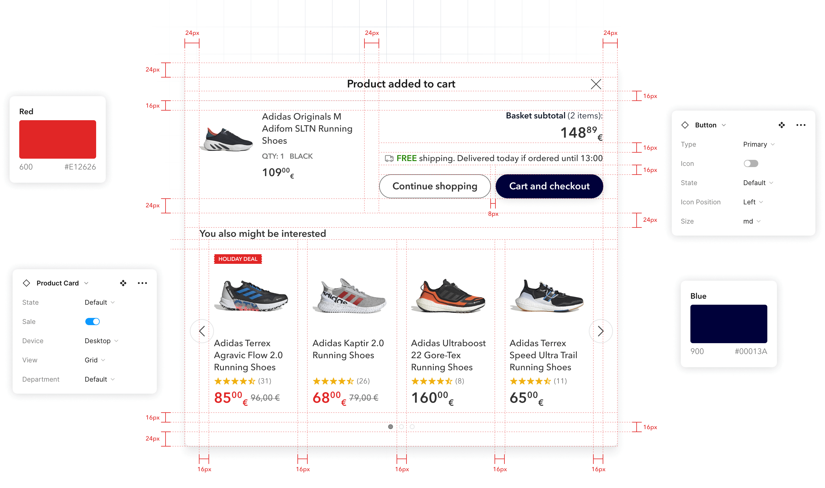
The previous design system lacked consistency and had poor documentation. Each element was constructed only using basic shapes, text, and groups, leading to a significant increase in the time required to create and maintain complex layouts, often taking four to five times longer. This proved to be a nightmare for both the development and design teams due to occasional inconsistencies and the resulting time wasted.
While migrating the whole design system from Sketch to Figma, I put up proper documentation and recreated each component and page layout using a consistent, responsive auto-layout structure and component variants. This significantly enhanced collaboration between the design and development teams, elevated the overall design quality, and resulted in considerable time savings.
The prior icon set was basically just random icons from various freebie sites alongside some icons that were created in-house. The main problem was that the icons were not created using the same grid or line width. It showed, especially on busy layouts where many icons were used simultaneously, resulting in visual clutter and an unprofessional appearance.
I recreated the icon set using a keyline system and a live stroke. This improved the overall aesthetic appeal and helped icon-busy layouts not be so cramped because icon line width could be adjusted.

There was a problem with copywriting standards, and I mean the lack of them. In a long paragraph, sometimes links were scattered all over, or at the end of it there was a “click here” link (e.g. “If you would like to return an item click here.”). Users had to read the text around the link to figure out where they will be taken. Sometimes the words in a line of text were written in uppercase to emphasise. It was a pain to read, and it looked more like a cheap ad than a professional website.
Based on eye-tracking and other usability research data, I suggested new guidelines for copywriting and link text. These proposed changes aimed to enhance accessibility, improve SEO, and elevate the overall professional appearance of the website.
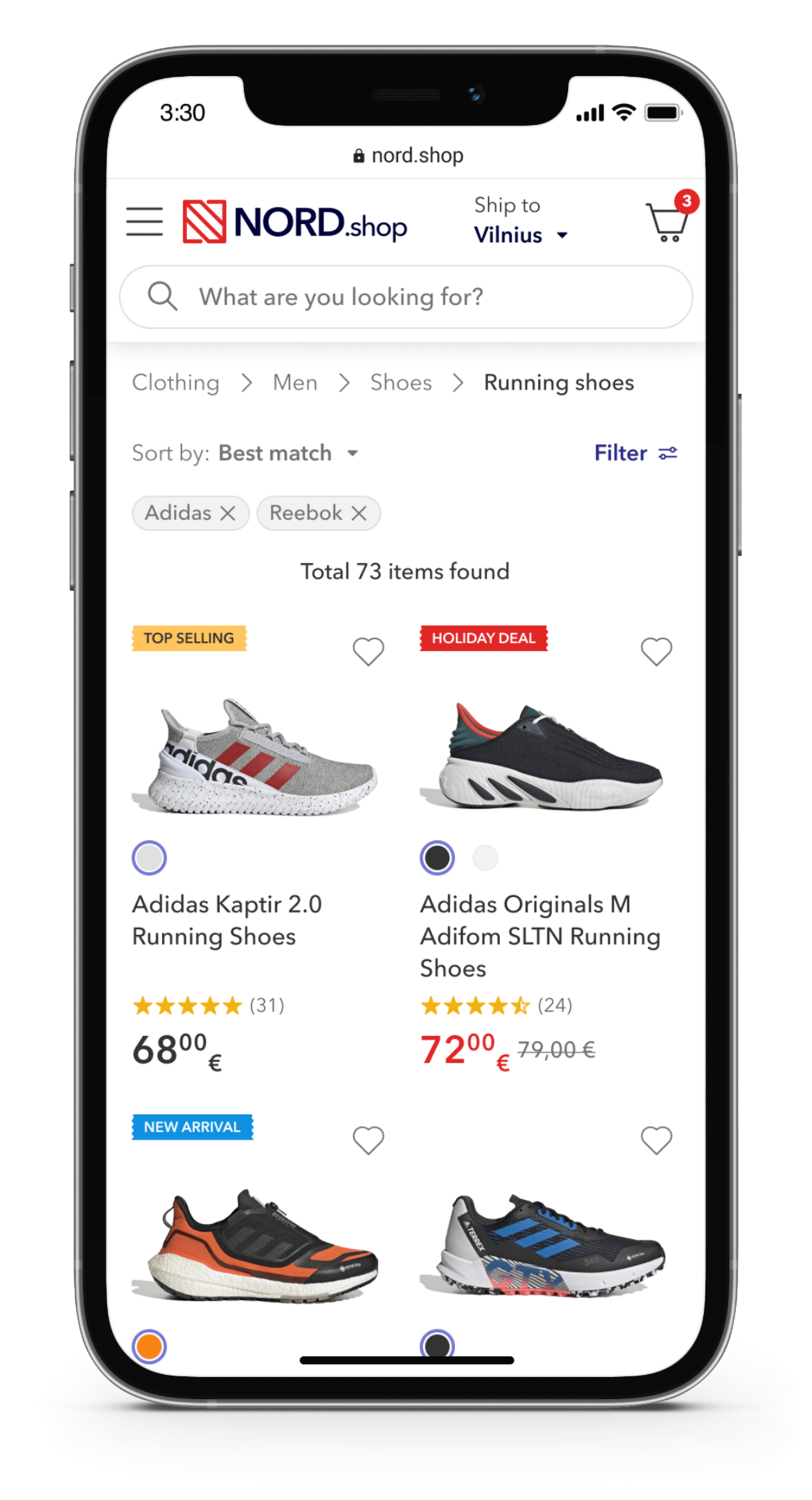
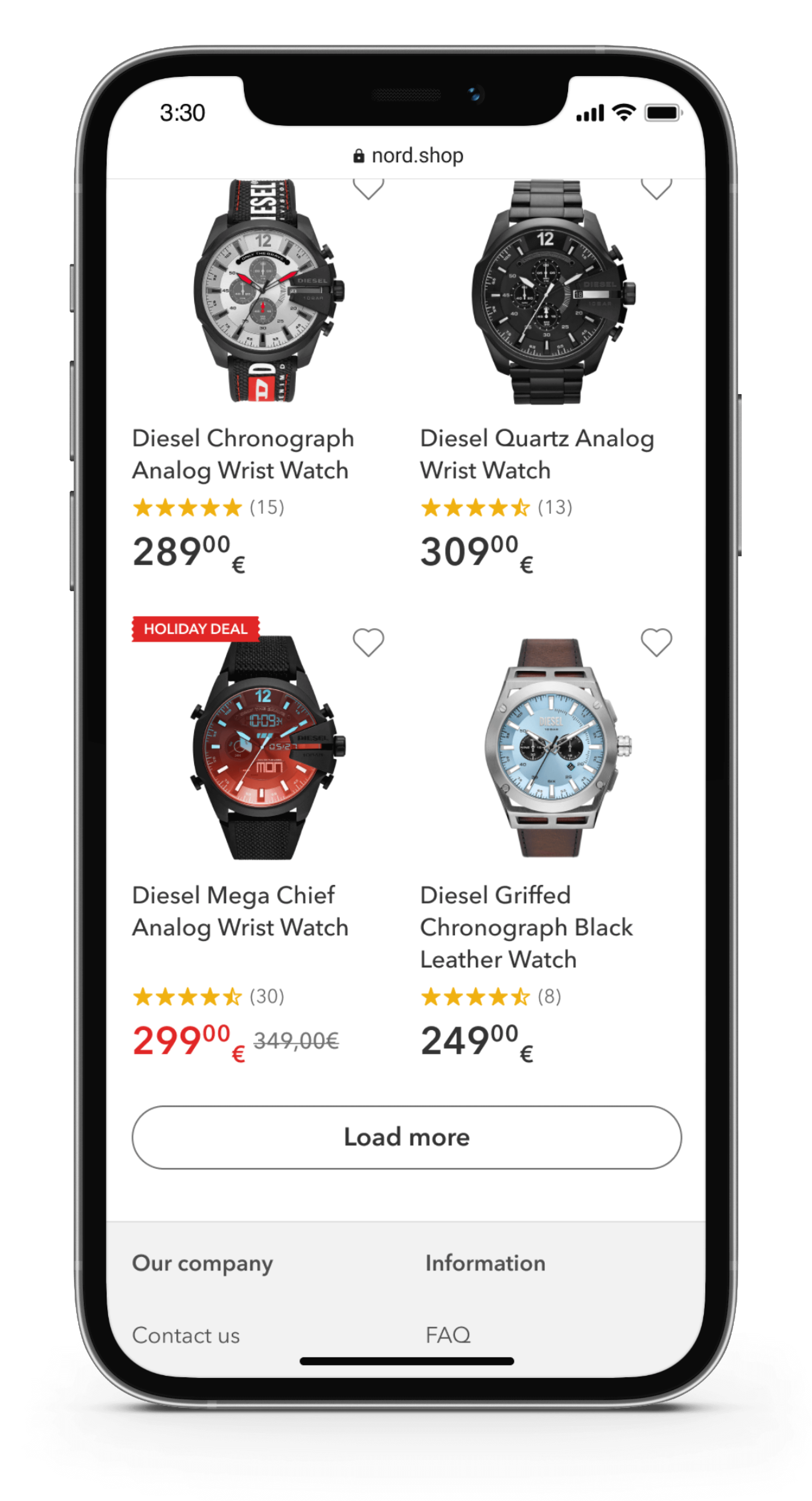
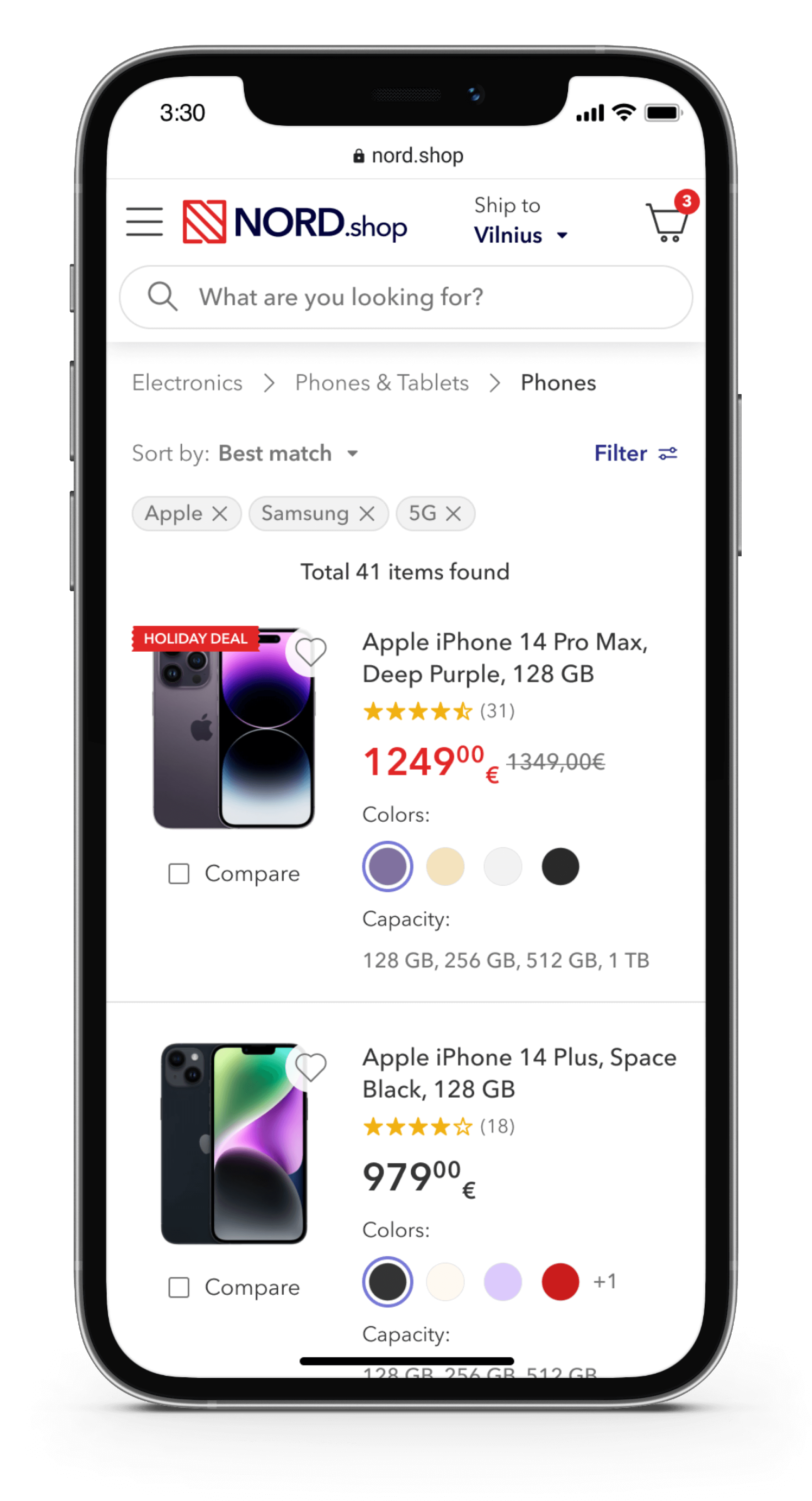
Users encountered considerable usability issues when it came to discovering, scanning, and comparing product list items:
List items had a fixed height of 413 px, which is more than half of the viewport height, and would not adapt to the content of the list item. Usability research showed that users find it difficult to browse and distinguish between products when they take up more than 50% of the viewport height because they must remember more items.
By restructuring the content and eliminating low-impact or distracting elements, I redesigned the list item to occupy 32% less height in grid view and 16% less height in list view. This significant reduction greatly enhanced the discoverability, scanning, and comparison of product list items.
Inconsistencies were present in the placement and formatting of specifications within the titles and separately below them. Some titles included the specifications, while in other cases, the specifications were listed below the title or presented differently. These inconsistencies posed a challenge for users trying to swiftly scan items for their specifications.
To enhance the scanability of product list items, I eliminated the specification list from the item and established guidelines for the product titles. The guidelines ensured that the most crucial information, such as "Brand, color, specs," followed a specific order.
Additionally, I proposed implementing an automatic view switch based on the nature of the product. For visually-driven products, the system would switch to grid view, while for spec-driven products, it would switch to list view.
Some marketing labels were ambiguous and were used excessively, which ended up causing confusion and cluttering the screen.
I recommended to get rid of labels that don't provide any value or meaning to the user, e.g. "Good price", "Superdeal", etc. and made the remaining labels clearer, e.g. changed "Top" to "Top selling", so that users won't have to wonder what it means.
The product star rating was outputted unconventionally, e.g. " 3.5/5". Users couldn't scan the list for star ratings visually, because they had to examine the numbers which means more cognitive load. Also, the total number of ratings was not displayed which discouraged users from placing their trust in the overall rating.
As part of my standardization efforts, I implemented consistent star rating output and displayed the total number of reviews in the list item. This approach made the star rating easily scannable, allowing users to quickly see the product's rating. Moreover, by including the total number of reviews, users could make informed decisions based not only on the average rating but also on the number of people who reviewed the product. Usability research revealed that the quantity of reviews held significant importance to users.
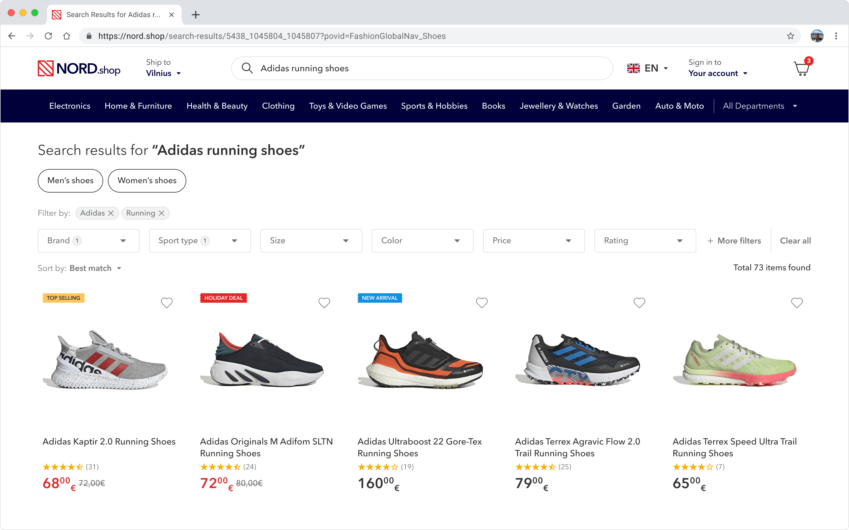
In certain instances, users may not provide the most specific keywords for the search engine to accurately match their intended criteria. For example, if a user searches for "Adidas running shoes" without specifying the gender, the search results would include both men's and women's shoes, resulting in approximately 50% redundant products being displayed.
I suggested implementing guided search requests to address lower quality search queries. For instance, when a search query lacks a specific factor, such as "Adidas running shoes" without specifying the gender, two filters, "Men's shoes" and "Women's shoes", could be presented. This allows users to quickly narrow down their options and discard approximately 50% of potentially irrelevant products.
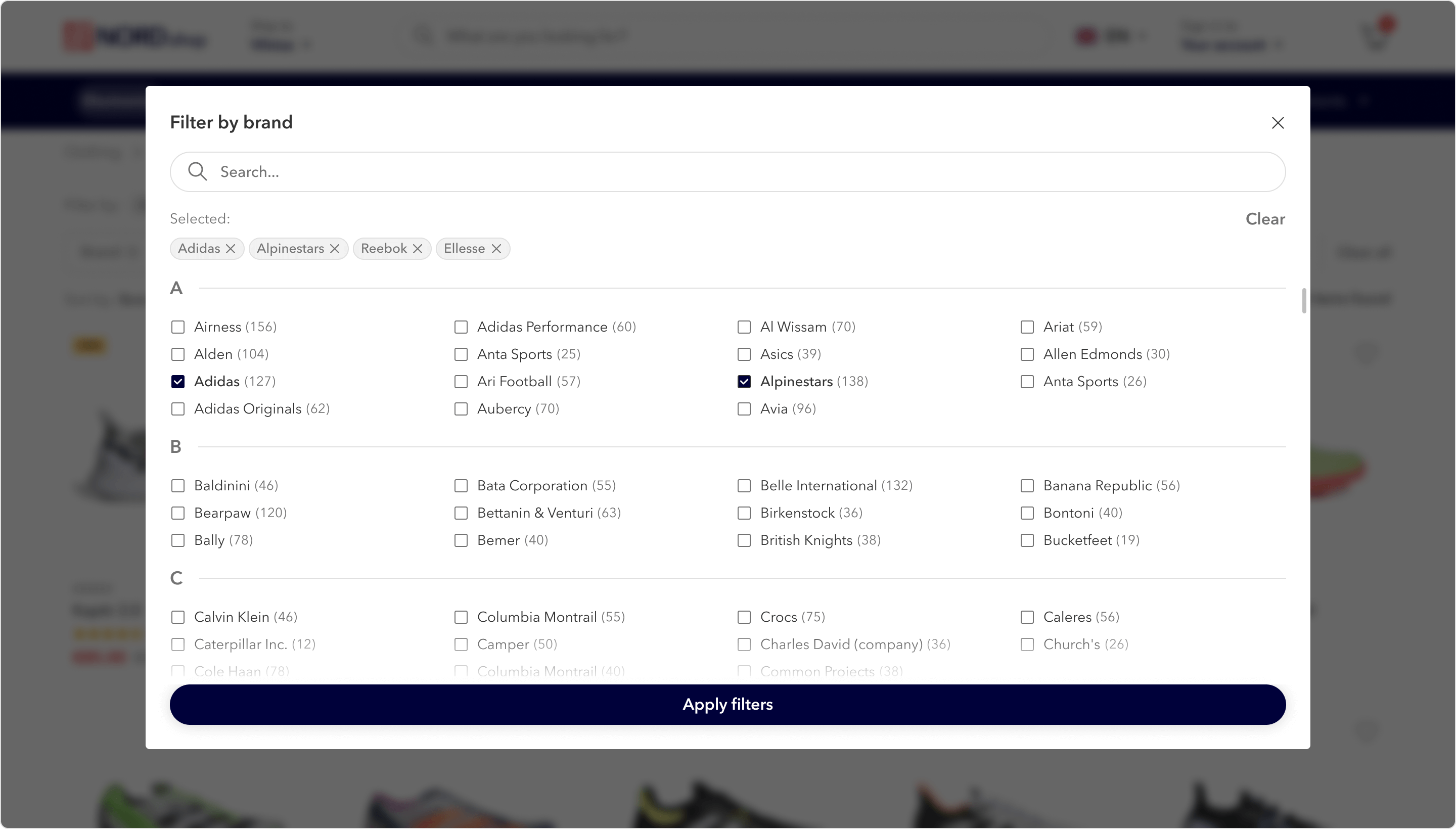
According to Baymard's usability testing, some users have a difficult time finding filters in the sidebar or simply overlook them. Also, some filters with hundreds of subcategories, such as "filter by brand" made the sidebar and, by consequence, the page tediously long.
I relocated the filters from the sidebar to the top of the page, enhancing their visibility and usability. Additionally, by removing the sidebar, we were able to free up 20% more space for content, resulting in a more spacious and engaging layout. Filters that included extensive subcategory lists were transformed into modal windows, ensuring that they no longer impacted the height of the page.
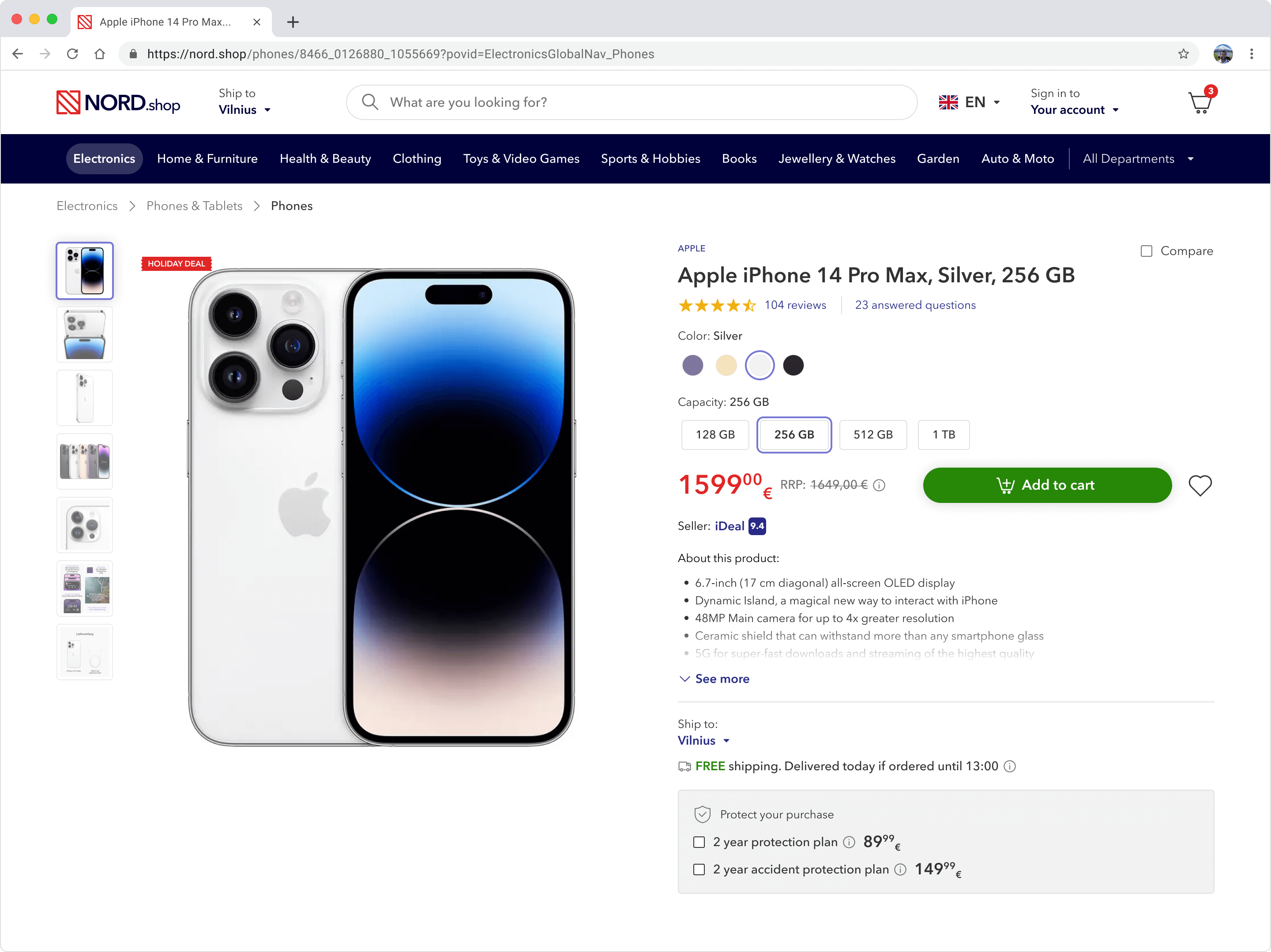
The "Buy" section of the product pages had an excessive number of extraneous options positioned prominently. These included coupon codes, multiple installment payment choices, shop credits information, and unnecessary disclaimers. This cluttered presentation overwhelmed and distracted users, leading to negative outcomes. Baymard Institute indicates that users found product pages with an overloaded "Buy" section to be intimidating, resulting in delays or completely driving users away from adding products to their cart.
Moreover, variations such as size were presented within a dropdown menu, leading some users to overlook available options or, in some cases, having to open the dropdown to discover that the desired variation was out of stock.
I prioritized essential elements within the "Buy" section. Key elements such as variation selection, price, the "Add to Cart" button, and basic product and delivery details were given more prominence. Additionally, I repositioned extraneous options below the main "Buy" section, allowing users to add products to their cart without being overwhelmed by irrelevant choices.
Furthermore, I redesigned each product variation to have its own dedicated button. This modification made the selection process more intuitive and evident for users, eliminating the need to navigate through dropdown menus.
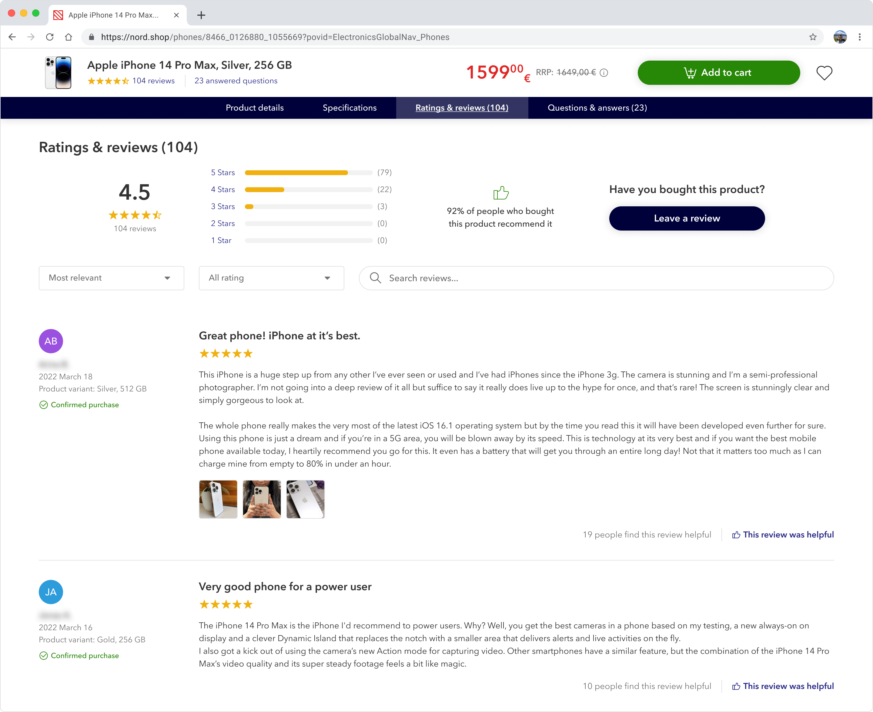
The absence of sticky navigation on the product page resulted in users getting lost within an overwhelmingly long page. Furthermore, the placement of a sticky "Add to cart" button at the bottom of the screen caused 22% of users to overlook it entirely.
I redesigned the sticky "Add to cart" and product page details navigation to stick to the top of the screen, allowing users to add items to their cart and access the product details much easier.
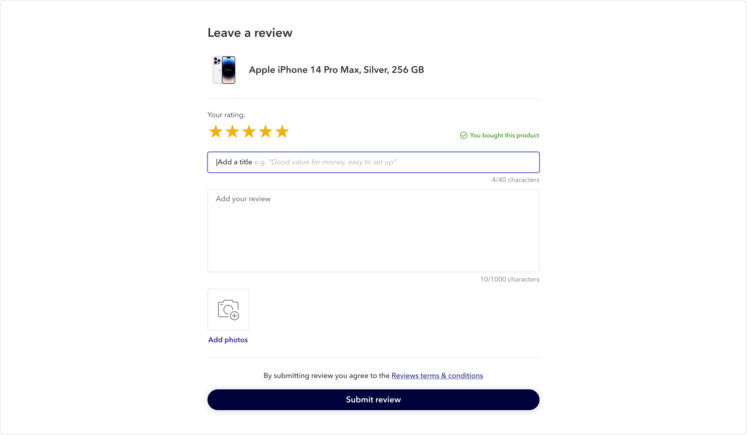
The reviews section suffered from the absence of review titles. Users were forced to spend extra time and effort scanning large blocks of text to find the review's key points or using the browser's search feature to highlight keywords.
I solved this issue by requiring reviewers to include the review title, which made it easier for review readers to find and recognize relevant information quickly. I also made it easier to write useful review titles by showing good examples as placeholder text.
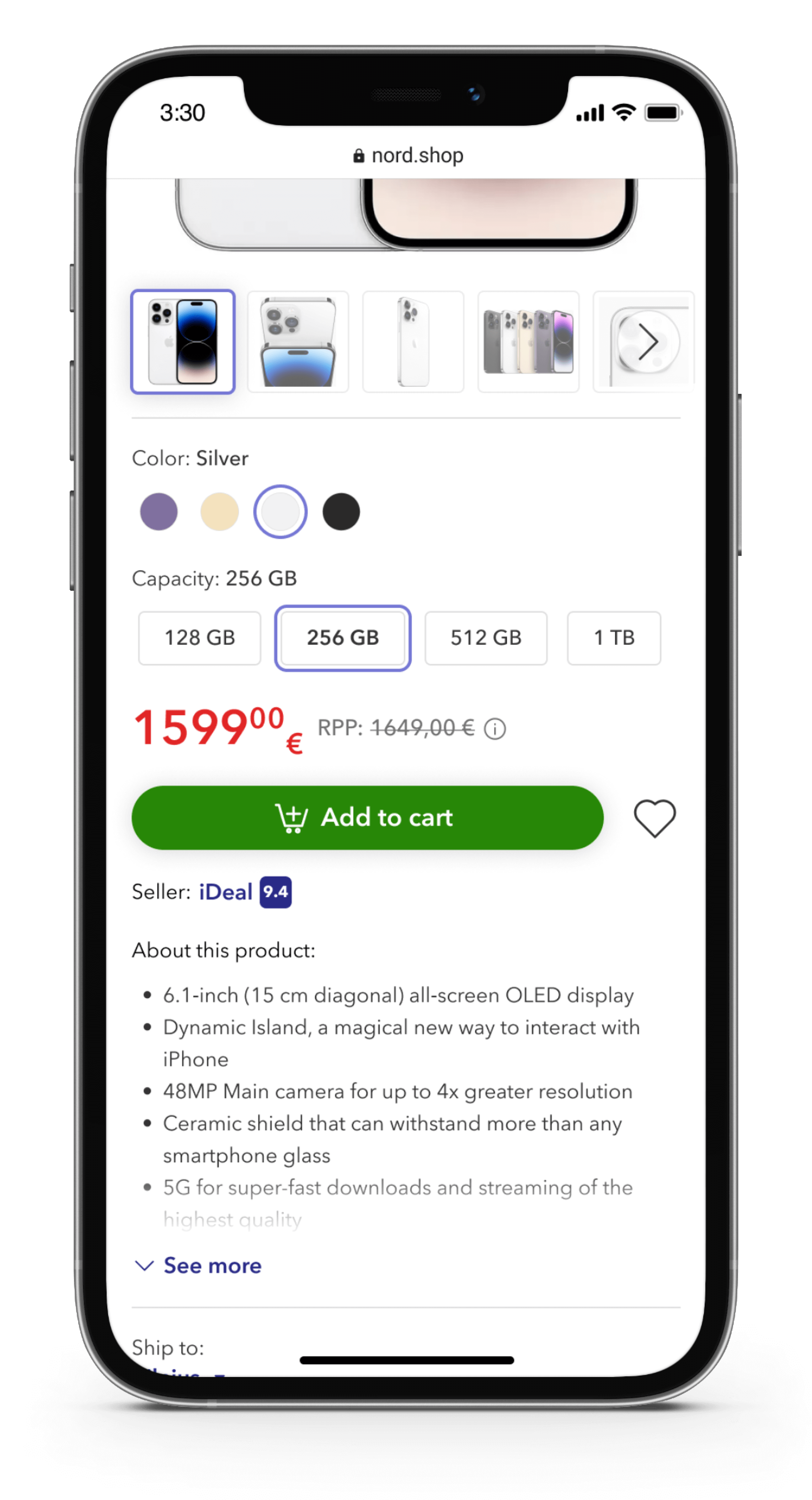
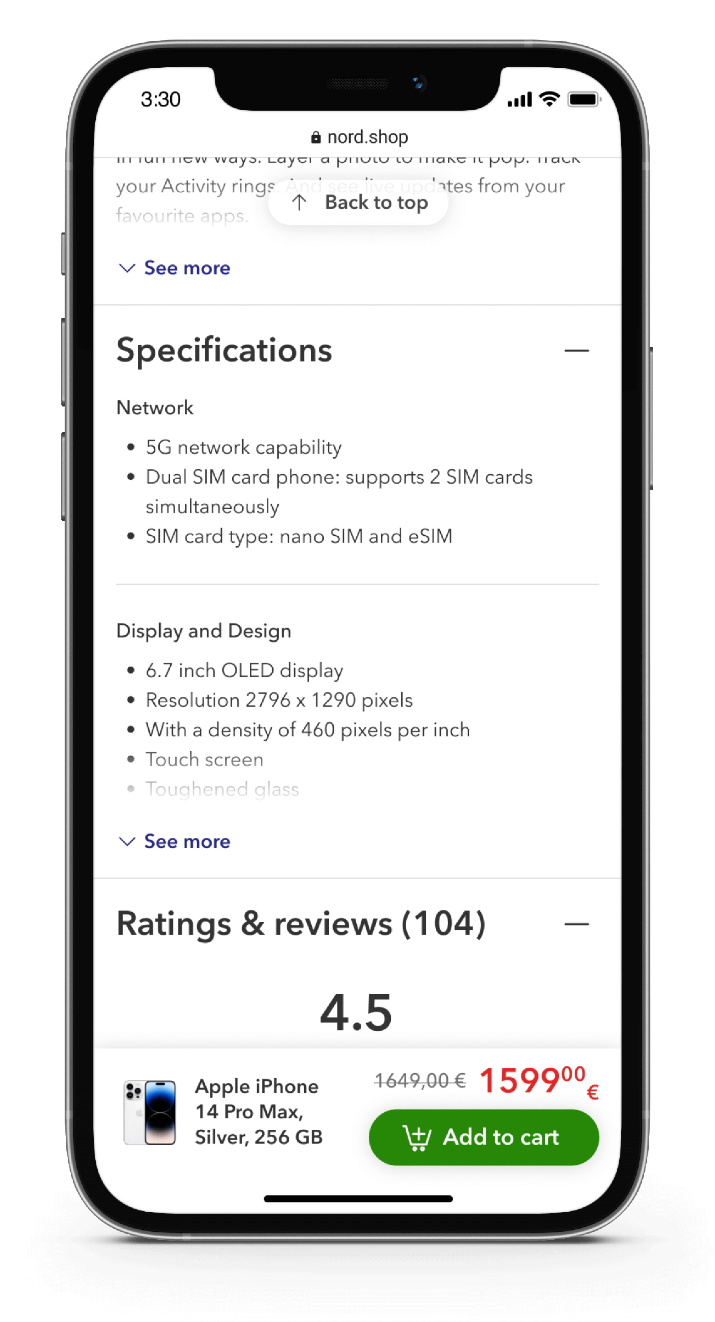
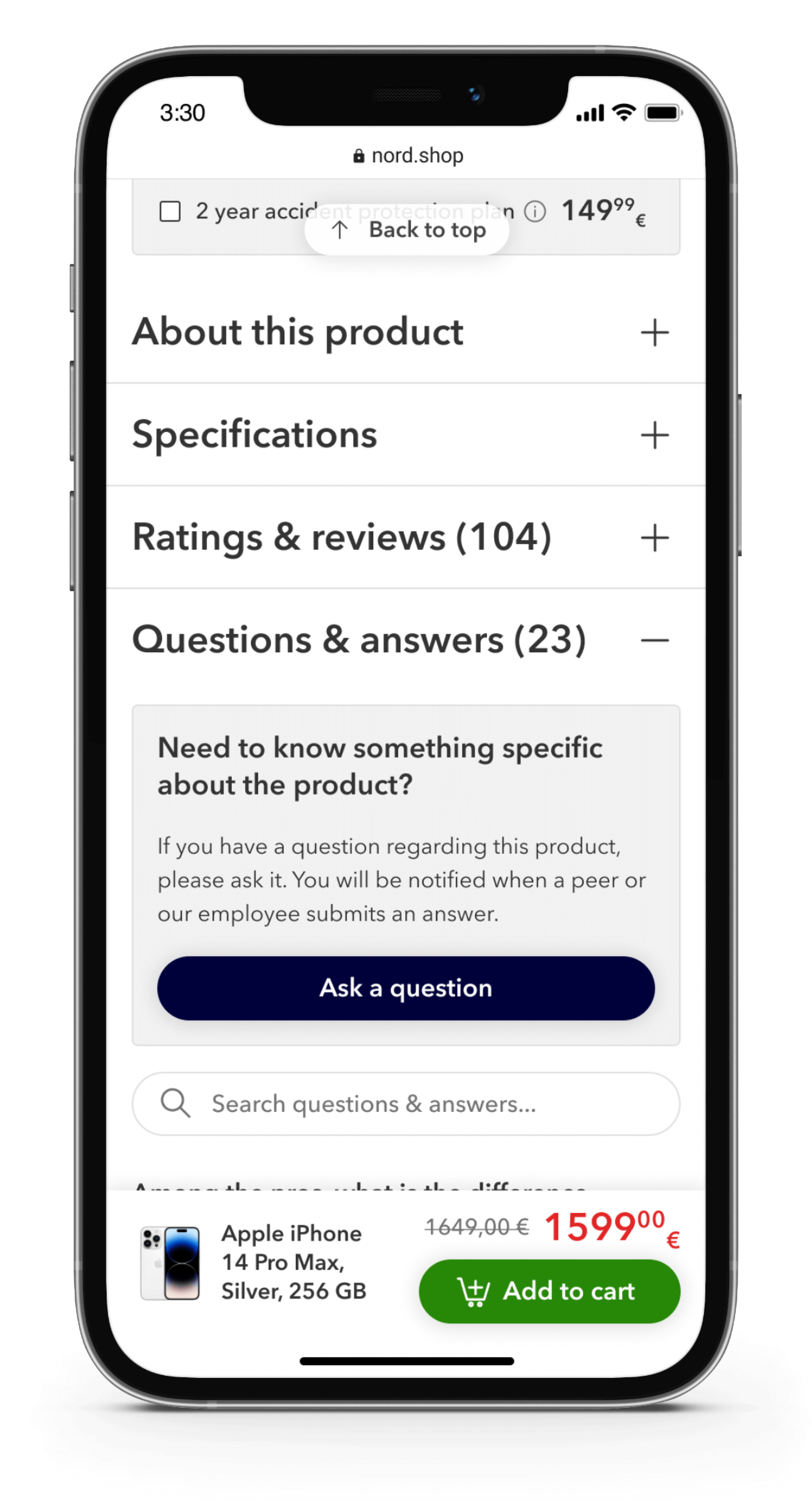
On both desktop and mobile devices, long product pages were problematic because users would become disoriented and overwhelmed by the volume of information. Sticky navigation solved this issue on the desktop. However, on mobile product pages, sticky navigation is a gamble because valuable screen real estate is lost and swipeable navigation is not the most efficient.
I found the optimal solution to be semi-expanded, vertically collapsed sections with a "see more" link, which allows users to easily find relevant information and discard the information that they don't need.
The order tracking page suffered from a lack of critical information: the estimated delivery date. Usability research revealed that 62% of users specifically sought the estimated delivery date upon reaching the order tracking page. Users want to plan their time, and having to only find an estimated interval of X to Y days in the order confirmation email was not acceptable to many.
In my redesign of the order tracking page, I prioritized the display of the estimated delivery date, ensuring it is the first piece of information users encounter.
*Instead of providing the delivery date, the delivery speed was utilized due to complications with the delivery service. While there were challenges in implementing the switch to the delivery date, I recommended this change as a more accurate and user-friendly approach.
All delivery events, e.g. "2022 Apr 22, 15:50, Order placed" and "2022 Apr 23, 8:19, Arrived at the courier facility" were listed in one horizontal sequence, sometimes making it up to eight items long, which made the page look overpacked and distracted users with often unnecessary information.
I discarded some of the ambiguous event titles and split the important ones into statuses and sub-events. To further reduce user distraction, sub-events were hidden by default and presented in a modal sheet by clicking the "More information" link.
My inclusive approach, design solutions backed with data, and contribution to the workflow helped unify the collaborating teams towards a common goal.
Addressing usability issues reduced the site's abandonment rates and dramatically improved the overall shopping experience.
Consistent and aesthetically pleasing design helped the brand stand out and keep up a professional image, which brought in happy customers and sustained business growth.
Even though a data-backed position technically wins, the reality of products suffering from tech/UX debt is sometimes complicated.
I've learned to navigate my position effectively in times of dispute.
I've learned about legal and regional policies that are very important for projects of large scale.
If you're looking for help with your project or just want to say hello, drop me an email at and I will get back to you as soon as I can! ✌
Drop an email