When I was looking for work back in the late autumn of 2023, I found that Teamhood was looking for a senior product designer. I don't recall exactly what the job ad said, but I understood that they were small, hungry, and highly motivated startup, desiring to compete with the best in the business. After a couple calls with the CEO and CTO, I knew it was a perfect match, because I covered multiple vital areas, and they appreciated my proactivity during our initial communication. I got the job.
At first, I knew the product just as much as you'd expect someone new would—vaguely. The target audience, market positioning, and strategy was not super refined. We were basically trying to compete with Jira, Clickup, Monday, and other similar tools in a saturated market. I found out that loyal users already enjoyed Teamhood for it's speed, unique Kanban board structure, great customer support, and other things. User activation metrics showed that it was not enough, so I started looking into what could be wrong.
I ran an initial heuristics evaluation, something that I would do anywhere, just to quickly pin down general usability issues that typically hinders first time user experiences. I found the usual suspects: visual hierarchy issues, bad microcopy, unclear purpose of some elements, etc.
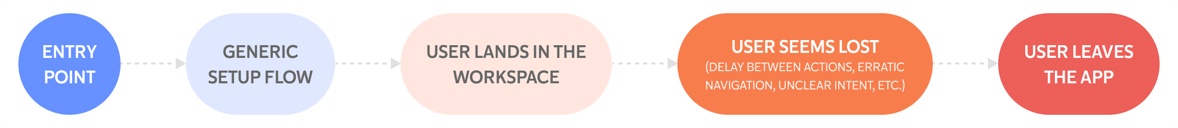
It wasn't surprising to see users struggle with the UI, but it was worse than that—they seemed to drag their feet through their entire first session. Most of the time, they seemed to have no clue where to start and what to do. There were plenty of random clicks, erratic navigation with no clear intent, delay between actions, and a pattern of sessions ending before the user gets to actually do something meaningful with the product.
This chart sums up what I saw in the Hotjar recordings:
I decided to go a bit further and run an exploratory usability test with someone who broadly fit our target audience. At this point, I was not looking to run a full testing campaign. The goal was to see if the same issues appeared.
Here are some notes from the usability testing:
User didn’t understand some of the terminology or the differences between the options and was hesitant to click anything. User comment: “Why I can’t I choose multiple...?”
Vague UI depictions didn’t help the user understand how it resembled their choice. User comment: “I don't understand, are they trying to show that they have a calculator...?”
User goes through the eight step guide, but the information seems to be overwhelming for the first time. Hotjar recordings showed that most users just skimmed through it.
After landing in the workspace, user seems completely lost and hesitant to click anything. They click mostly randomly with very little meaningful engagement, followed by a question: “Maybe I chose a too complicated view?”
Test results correlated accurately with the Hotjar recordings. Most users didn't reach the "aha!" moment, because: A) they were on their own to find the core features in a busy interface, and B) they eventually quit, because they couldn't find value in time. In fact, the average session length was about the same where users quit before doing anything meaningful. Even with amazing features, they're completely wasted if nobody can discover them in time.
At this point, it was clear that new users were struggling getting started, discovering core features, and seeing the product’s value early on.
I layed down the basic strategic steps to address these first session issues (I explicitly talk about strategy in one of the following chapters), but before that, I wanted to walk you through some of the steps that we decided to take first.
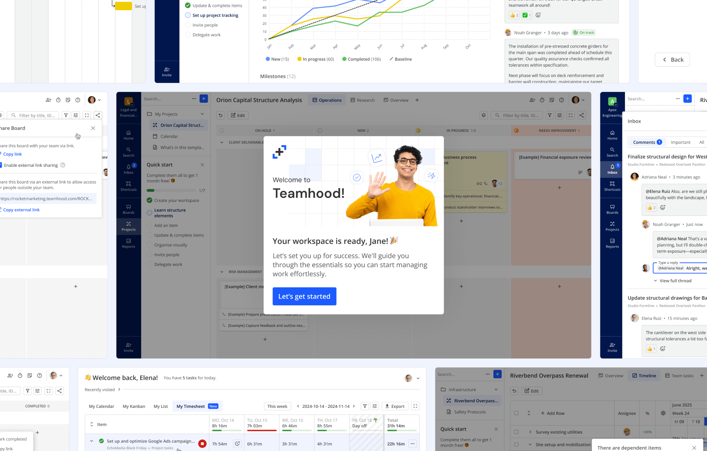
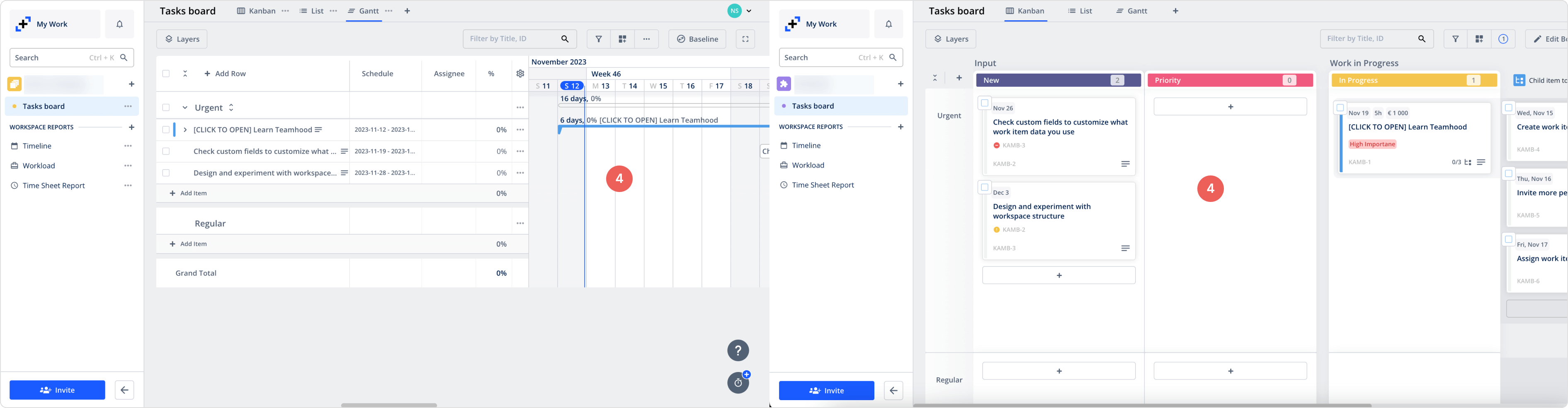
One of the key sections of Teamhood is My Work (later renamed Home), which in a nutshell is user's homepage, where they can see items assigned to them, what is due and overdue, workspaces that they are a part of, and so on. Most importantly, it's a section that many users interact with during their first session, and we caught multiple instances where they got stuck.
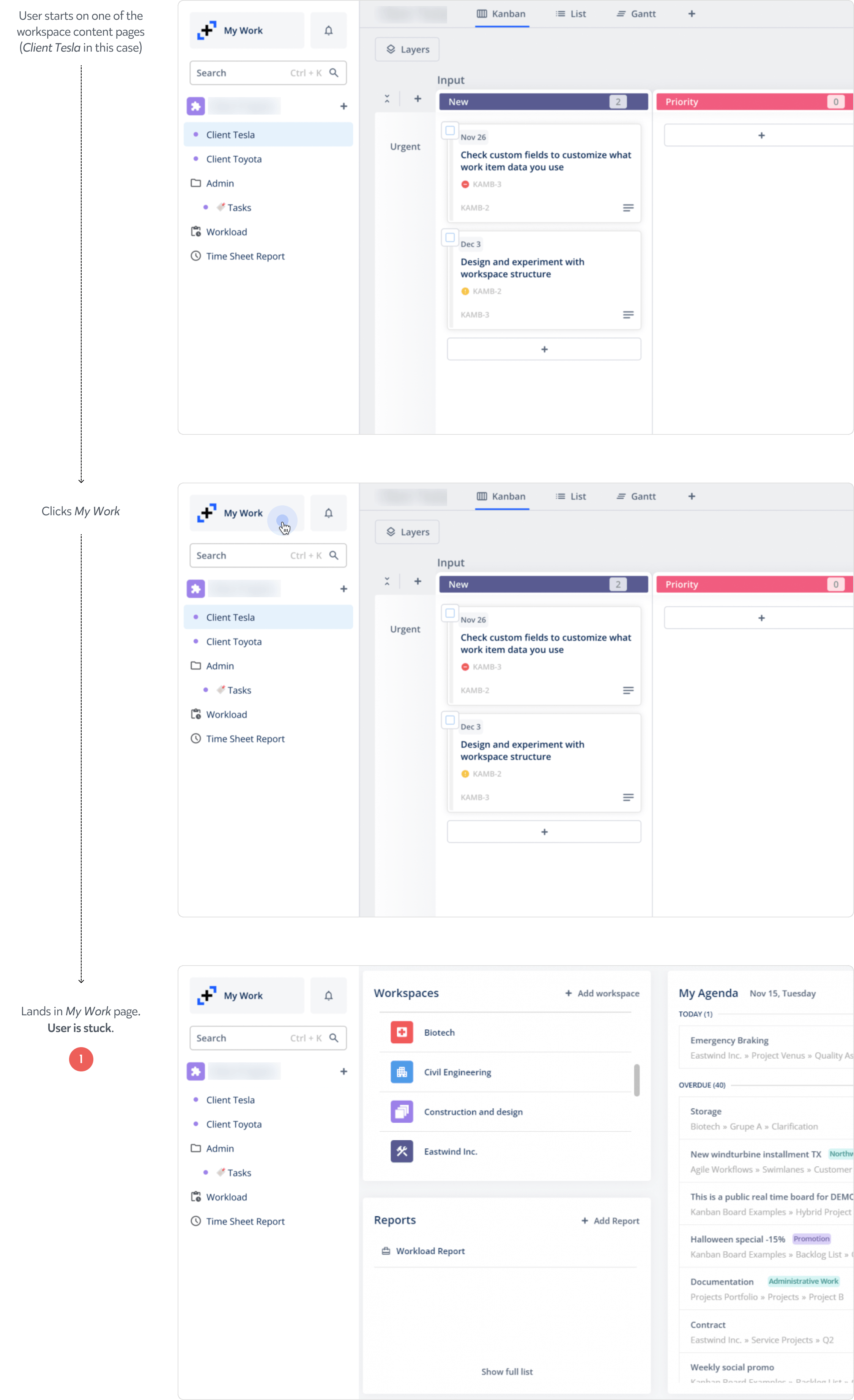
Users got stuck in the My Work page because there was no obvious way to get back to the previous page.
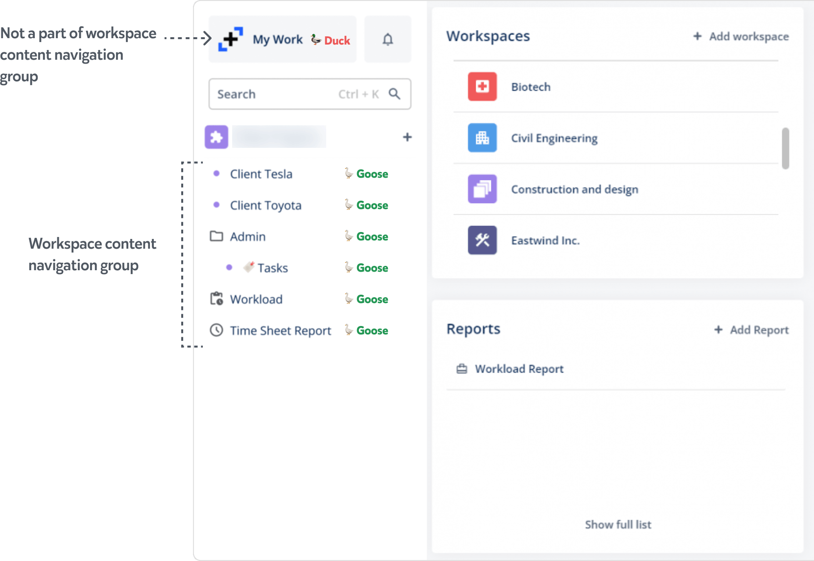
Interestingly, the sidebar navigation was still present on the My Work screen, but it didn't occur for the users to use it to go back, even though they had no problem navigating between the content pages. The reason behind this is that they saw it as unrelated elements.
With no semantic connection, or not having memorised which page they were on, users were naturally looking for a way back—in this case, a "Close" or "Go back" button.
To keep things simple, we decided to do exactly that. We reused an already existing toggleable overlay component to contain the section, and to make the sidebar more compact, replaced the button with an icon. This section didn't have a well established title, and was also referred to as Home or My Agenda by our users and our team. We agreed that Home had a better associasion to the content, and it was simpler to understand.
After testing the prototype in-house, we shipped it, and this is what we saw in the Hotjar recordings:
If users couldn't find what they were looking for on the Home page, they could easily find a way to close it and go back to the previous page.
There was consistent evidence that we got rid of the problem completely. What makes it even better—we managed to do this with minimal scope. The design solution was simple, and we reused an existing UI component for the implementation. It was very important to take this blocker out early so we could observe users interact with the rest of the product.
Retitling of Home didn't introduce any problems. In fact, it was easier guiding users during demos, because we could say, "Click Home" universally in all languages. What's most important, we didn't see a single case of users getting stuck.
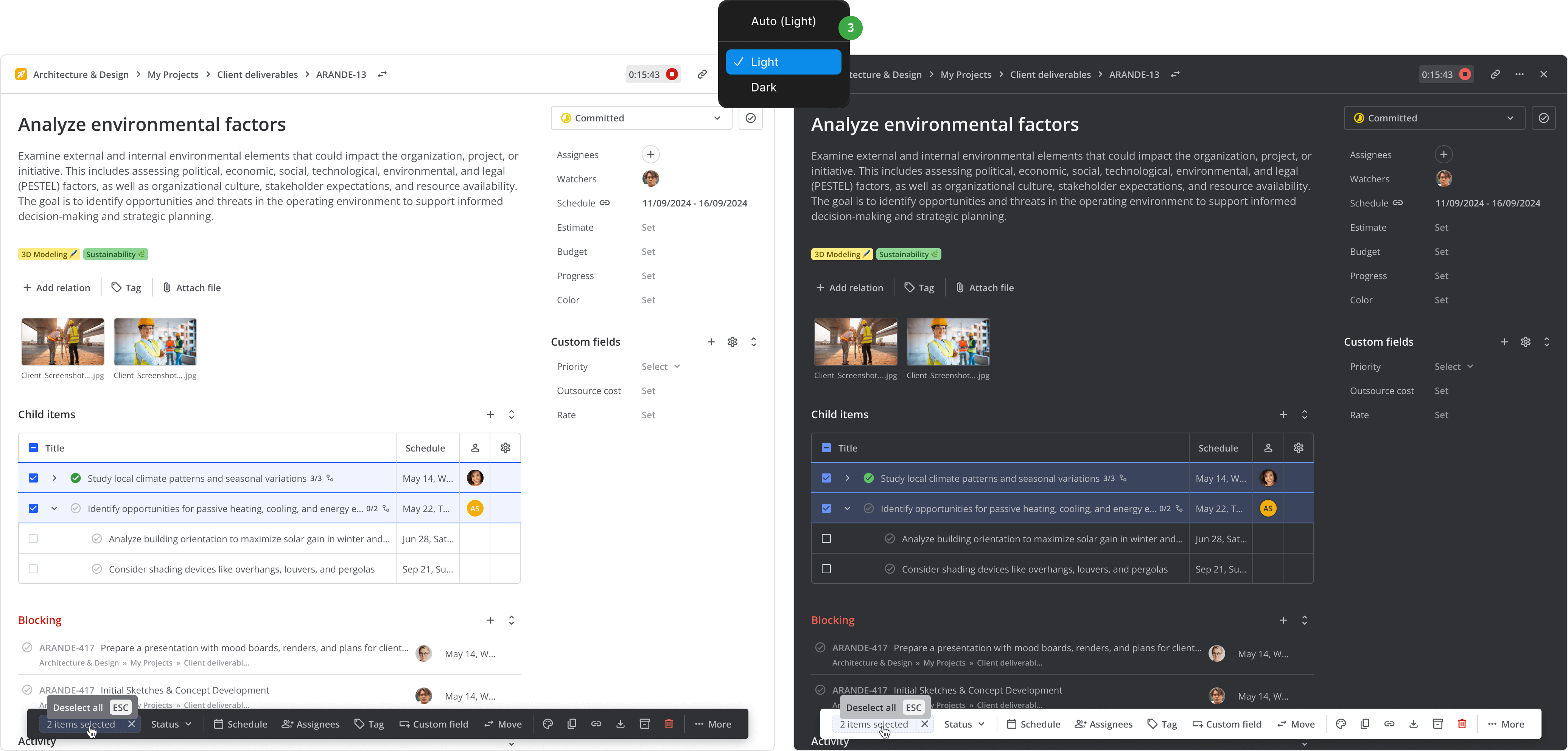
We started to look for ways to improve the UI of the core features to make it more intuitive. Before any UI-intense work, I always try to make sure the fundamental building blocks are there. Why? Because design system inconsistencies lead to guesswork for the engineers, that lead to inconsistent implementations, that lead to me pointing at each element during the QA round... It can become a tedious scraping job real quick, and nobody wants that. Also, Teamhood had very recently introduced the dark theme, so it was the perfect timing to do the all-things-design audit.
Most culprits were the usual suspects:
Decluttering
It was not the first time when I find the whole app's design assets all under a single large file. I'm guessing they all start small, and eventually become too large to find motivation to reorganise. Here's a tip: even if it's a one-time freelance gig, it's best to create separate files for different sections and categories. That way it's easier to find things, the risk of data loss is minimised, and load times are much faster once they get larger. You’ll thank yourself later if you need to work on it again, or if someone else does, they'll thank you.
As we progressed with the app, I eventually moved all design assets to their own files. I'll admit, working at a Lean startup, a certain amount of chaos remained inevitable, but decluttering was a firm step toward building a mature design culture inside the company.
Auto-layout
It's surprising how many designers don't use it, and it boggles me why. It could be intimidating for someone new, and that I completely understand, but I've seen senior designers not use it, some even proudly declare not using it because according to them it saves time. This couldn't be further from the truth. Not using auto-layout not only slows work down immensely; in complex interfaces, it is objectively an absolute disaster not to use it, because without it, you are running the risk of inconsistencies across the product. These inconsistencies eventually pile up, and it gets to the point where the source of truth becomes freely interpreted.
There were instances of exactly this, but we managed to catch them in time. Later, we imprinted using variables and auto-layout as one of the design guidelines.
Color cleanup and theme tokens
Dark theme was recently introduced, and there were plenty of awkward translations when switching between the themes. Some elements were using exotic colors that looked random, and overall the UI looked messy when it didn't have to. Also, a paralel issue was rising—the amount of design work practically doubled since everything now needed to be designed for the dark theme as well. I raised these as urgent issues, because I was afraid that if we didn't do this this now, a better time might never come.
I did a thorough colorbase audit, and found 17 near-duplicates that were overcomplicating what should be a simple and seamless translation. Working closely with the engineers, we managed to merge the near-duplicates. After the merge, it was much easier to find the appropriate color matches, and the UI felt easier on the eyes right away in both light and dark themes.
What was even better—Figma's variables had already came out of beta. It was the perfect moment to introduce automation that could save us massive amounts of time. I tokenized our colorbase, which allowed to switch between the themes in Figma with just a couple of clicks.
Tokenizing the colorbase allowed to switch between the themes in Figma with just a couple of clicks.
As the product grew and the files eventually got larger, it was obvious that we would have drowned without segmentation. With auto-layout, our design processes became much more agile, e.g. during design reviews, sometimes we improvised and switched up the UI on the go, without losing structure or precision. The engineers expressed much love toward the new design changes, because it practically eliminated their guesswork.
With solid building blocks, our design process became more streamlined each week. Future-proofing and supercharging the design system early equiped us to deal with continuous iterations much better and a lot faster.
Many new users couldn't make use of Teamhood's core features before eventually quitting the app. I wanted to show a few examples of these cases and how we fixed them.
The importance of visual hierarchy
One of our unique selling points was the flexible Kanban board structure, where you could set (or some templates had it set) columns to have sub-statuses. It's a smart and powerful method for displaying big milestone tasks that include other tasks. It's something like Jira's epic, but with the relations displayed directly on the board. The problem was that many new users didn't seem to understand the logic behind the UI.
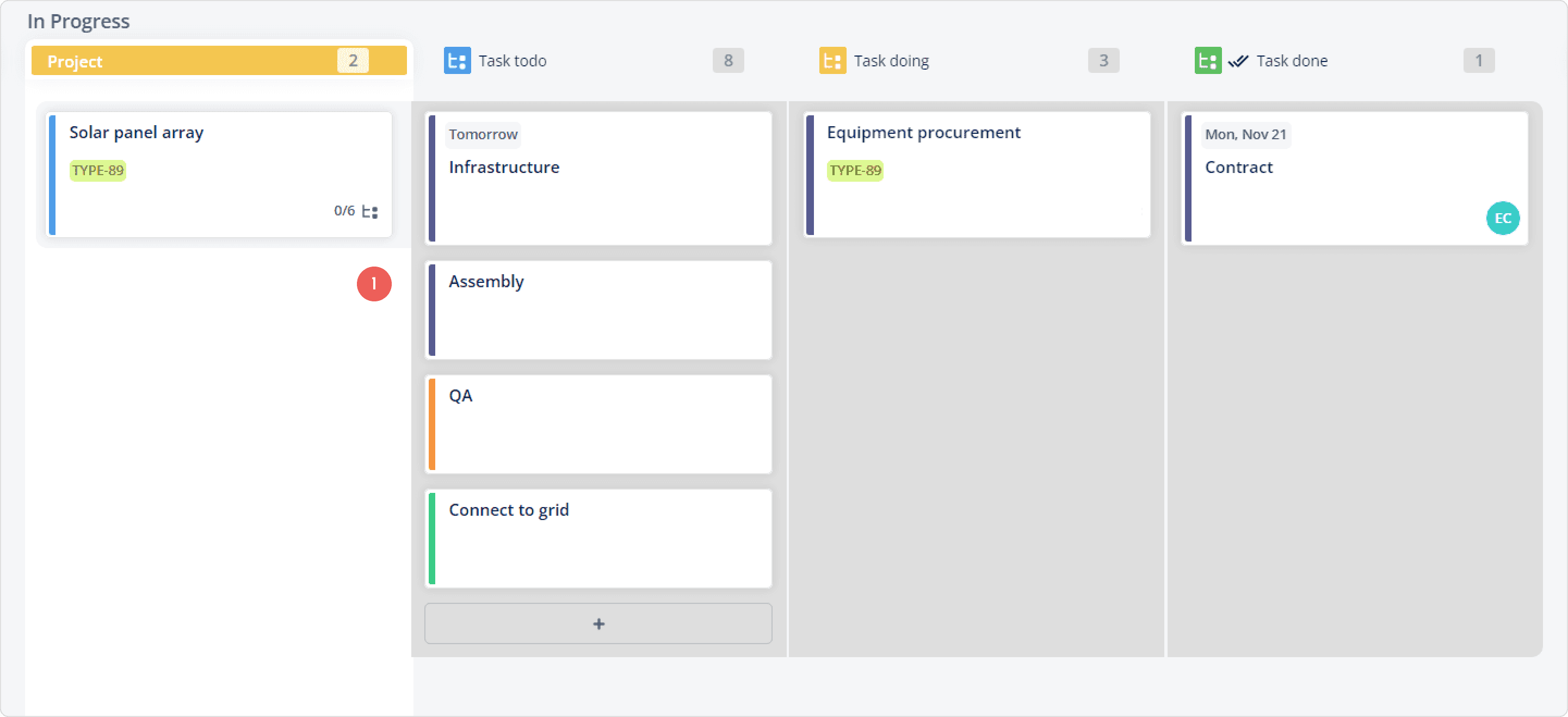
Many new users didn't seem to understand that the items in the grey background belong to the parent item on the left (i.e. "Solar panel array" is the parent item).
We observed users trying to drag tasks from other columns into the sub-status columns, drag the main task into the sub-status column, and similar repeated random actions. This indicated that users tried to achieve something simple, but it didn't work, and they had no clue why.
The logic behind the feature was rather simple, but users didn't seem to realise that the child items displayed in the sub-status columns belong to the parent item. I couldn't really blame them, because the UI did a poor job indicating the belonging. Since this appeared to be a purely visual hierarchy issue, there was no need to change the logic behind the feature, we needed only to emphasize the relation.
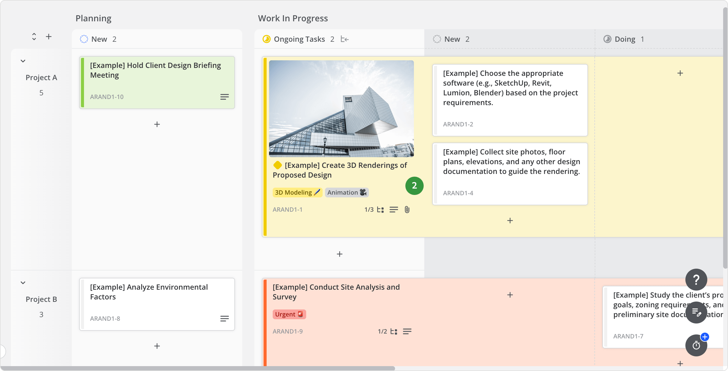
Improved visual hierarchy helped users understand the feature and parent/child item relation.
I redesigned the container component in a way that it's contents unmistakenly belong to it. This helped users understand the feature just by looking at it.
Turning visual noise into purpose
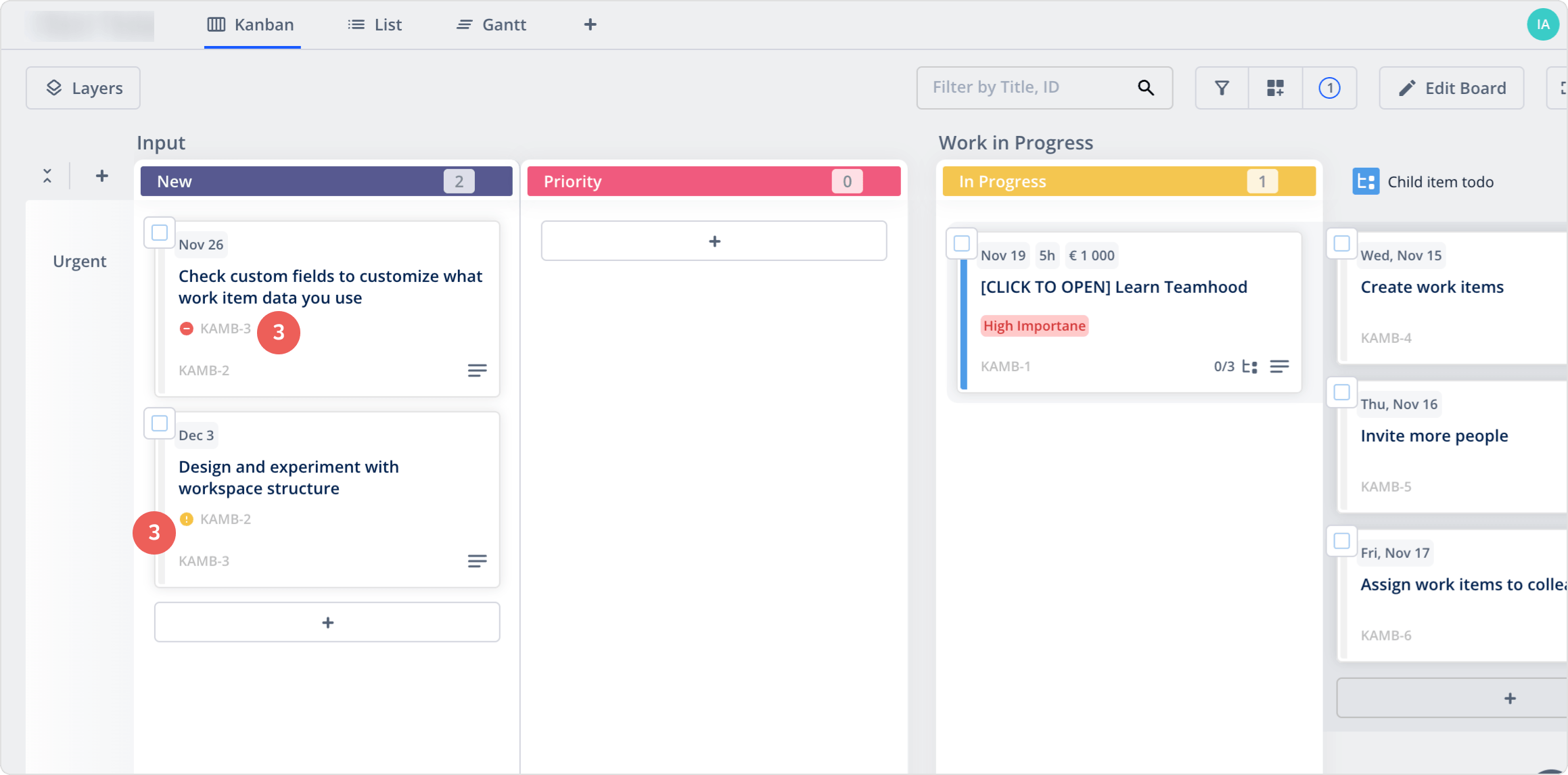
Another element that lacked clarity was the dependencies displayed directly on Kanban cards. Experienced users had no issues, but for the new ones, it was something extra to figure out in an already busy interface. Also, since the element was shown only as a prefix, you still had to open item details to see what it means.
For someone unfamiliar with the tool, the purpose of these elements was unclear.
I wanted each element to have a clear purpose, especially during the first sessions. To achieve this, I redesigned how dependencies were displayed; I listed the related items using the good old "rake" style, and added headers, explaining the relations, i.e. Blocking or Waiting on.
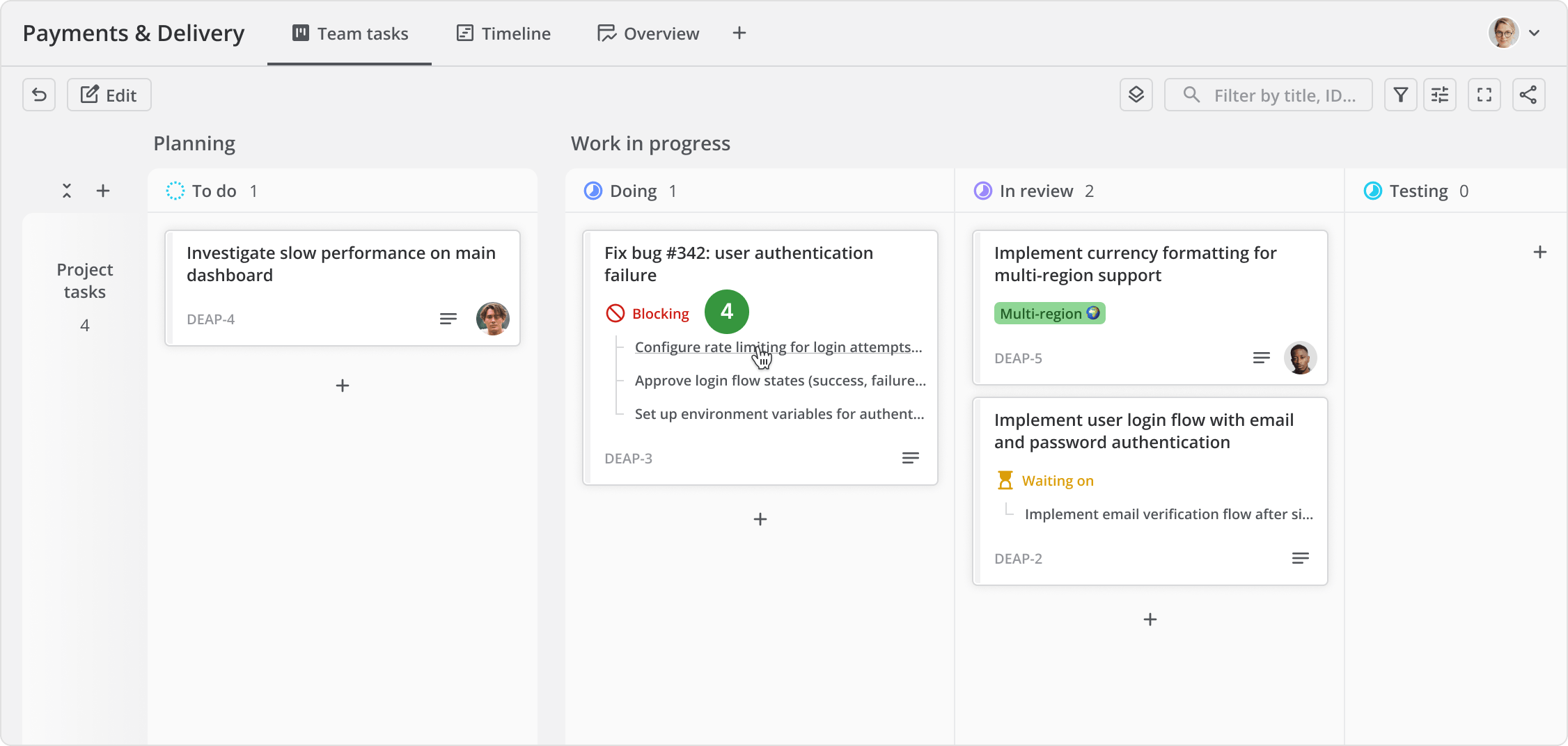
It's clear that the item "Fix bug #342: user authentication failure" is blocking the 3 listed items.
Clarity aside, there was a productivity improvement: the listed elements became links, so instead of opening item details just to see the dependencies, you could open related items directly from the card. We used Teamhood ourselves every day and noticed that navigating dependencies became much easier.
Improved system status visibility
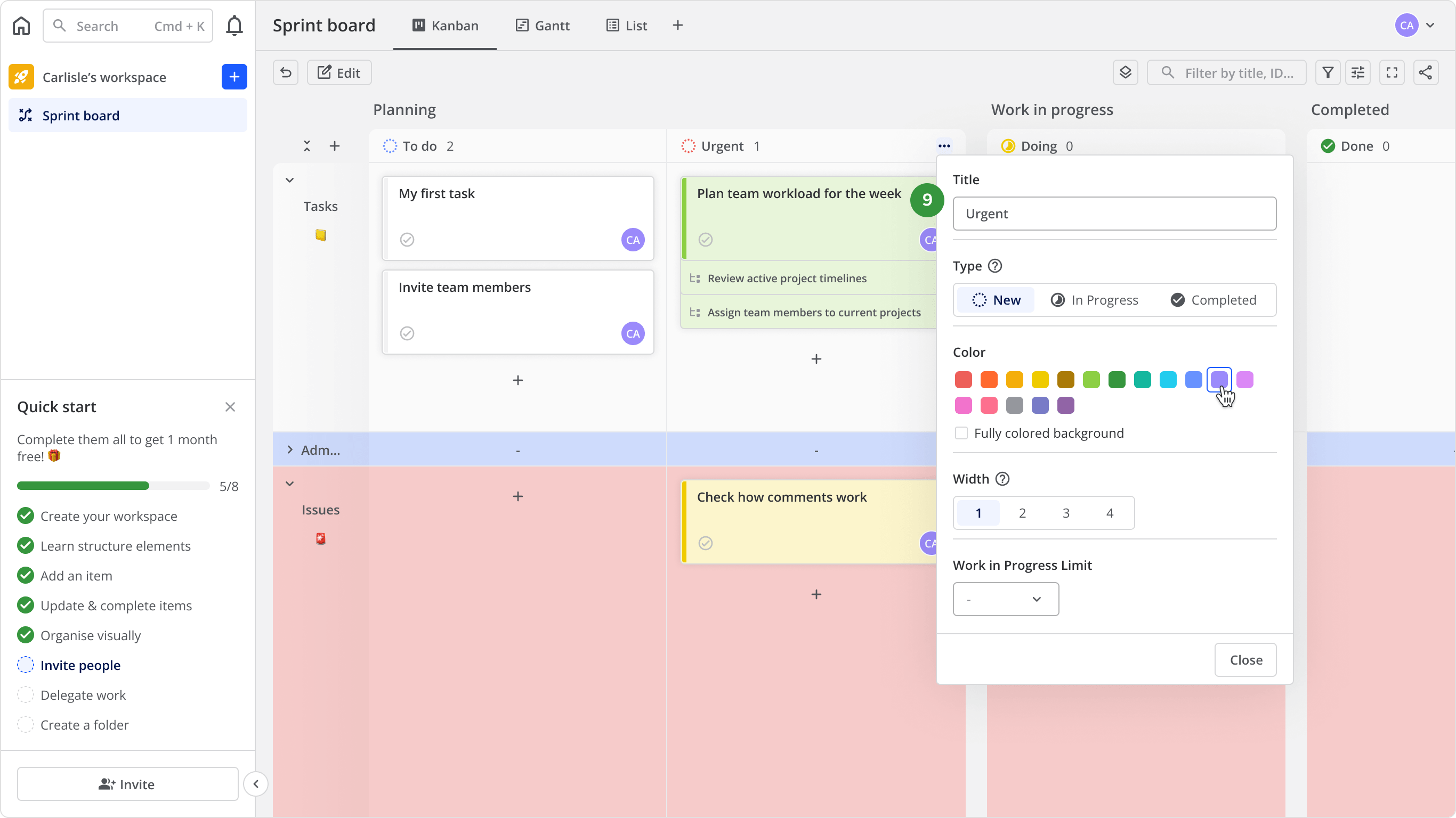
We received multiple complaints from some of our oldest tenants (in short, tenant is a business account with many users) about missing work items and lost view customizations. There were three main reasons for this: A) the view customizations were auto-reverted after a reload if not saved, B) the indication about unsaved changes was often overlooked, and C) there was no indication that some items are hidden due to filters.
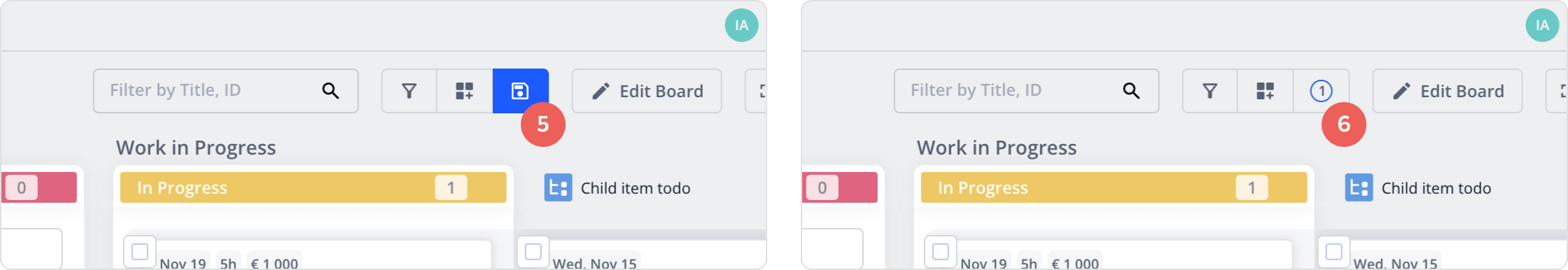
The blue "Save" button was the only indication about the view having unsaved changes.
The number in the bubble was the only indication about the saved changes that might be hiding items.
What made these problems more complex is that Teamhood is a real-time tool, and users see content based on both their own customizations and workspace-level customizations configured by admins. A few examples: A) user enables temporary filters to find items with a certain tag, B) user creates private view just with status columns they use, C) workspace admin creates different views with custom access for certain users. I won't go into every use case because there are simply too many. The important part is that this made the problem twice as confusing for new users.
We solved a good portion of the problem by making the customization settings non-auto-reverting, and adding an explicit message with clear CTA to remind users to save their view.
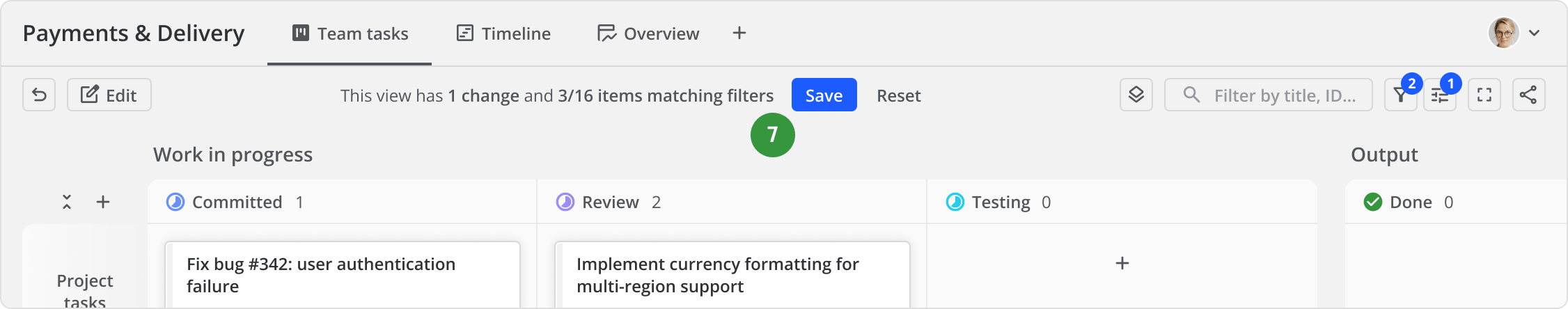
Explicit message informed users about what they're seeing, and clear CTA helped prevent losing unsaved settings.
I took it a bit further and added a message about items hidden by saved filters. I placed it at the bottom of the board, because I didn't want the same message to bother users all the time. If the user is looking for a specific item, they'll usually scan the board from left to right and top to bottom. If they can't find it, they'll eventually reach the message.
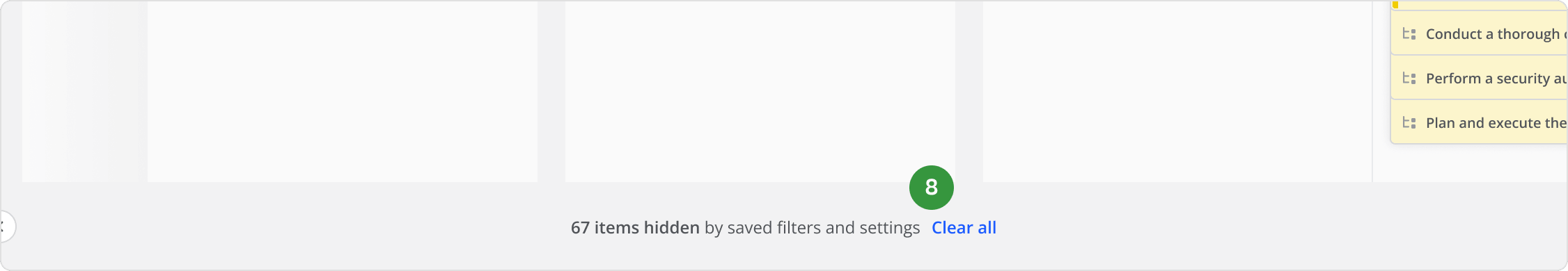
The message informed about items hidden by saved filters while not getting in the way.
After these improvements, session recordings showed less friction with both new and veteran users. Everyone seemed to understand the tool better, including ourselves. The complaints stopped, and we started getting praises about our overall UX. Following this, we improved semantics in other key areas of the product over time.
After semantic improvements, users could understand the purpose of integral elements just by looking at them. We stopped getting complaints and started getting consistent feedback about our Kanban boards being the best in the business.
As I mentioned in the beginning, session recordings showed that most new users were struggling to get started on their own, and the main issues were:
There was also another thing—the owners shared a narrative that software should be intuitive, so we shouldn't need to put effort into onboarding new users. It's an appealing and dangerously tempting notion, but it's simply not true; while simple apps like Shazam, Spotify, or Uber don't need onboarding because they are simplistic by nature, this does not apply to products whose complexity is what makes them useful. It's like riding an e-scooter vs driving a race car—one is easy to use out of the box, while the other needs deeper understanding in order to operate its controls.
We had feature gaps from our competition, and while it would seem more attractive to put resources into developing new tech instead of onboarding, the reality was that we were constantly losing users that we could win.
We already had a loyal customer base who loved the product for it's strengths. My strategy was to help new users discover those strengths early.
Here's a flowchart that breaks down each segment:
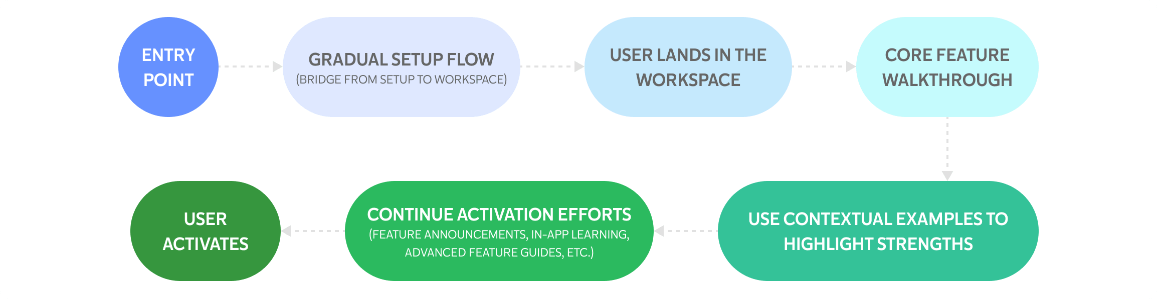
"User activates" was our success metric and the ideal outcome. While the outcome is impossible to guarantee, the strategy was strongly grounded in research: usability heuristics, industry standards and best practices, competitor analysis, and our own testing. It was a long road ahead, and I knew there will be bumps, but we agreed on the strategy, and I started redesigning.
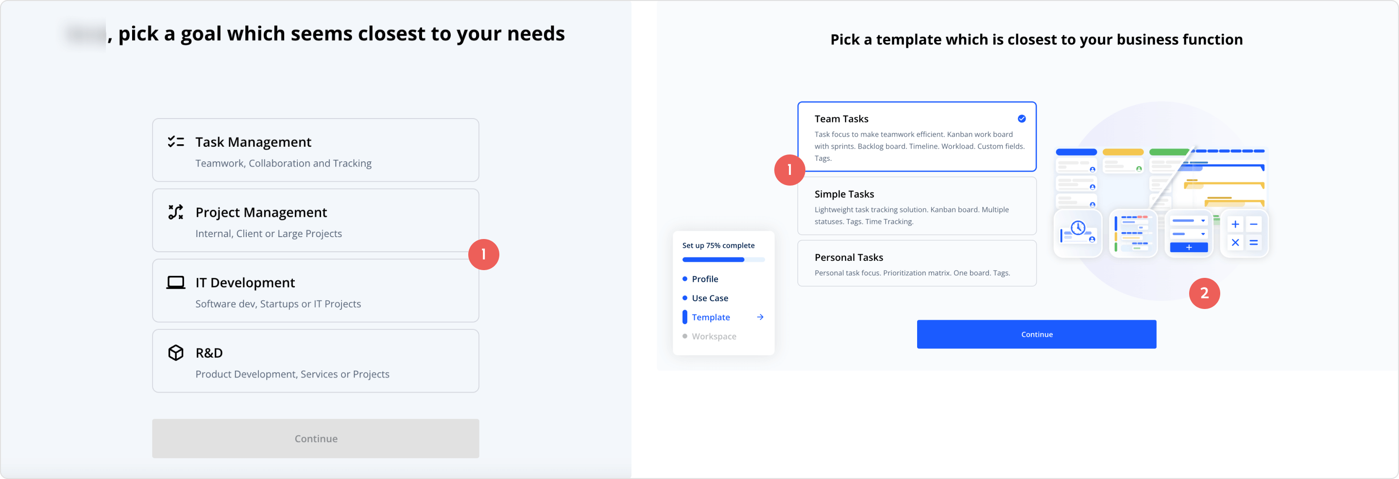
First, we got rid of the contradicting setup options, e.g. "Task management" vs. "Project management"; both may be needed, and forcing such an ambiguous choice introduced unnecessary friction and anxiety of making the wrong decision during one of the first steps.
Second, we needed to bridge the setup to the actual workspace in the least overwhelming way.
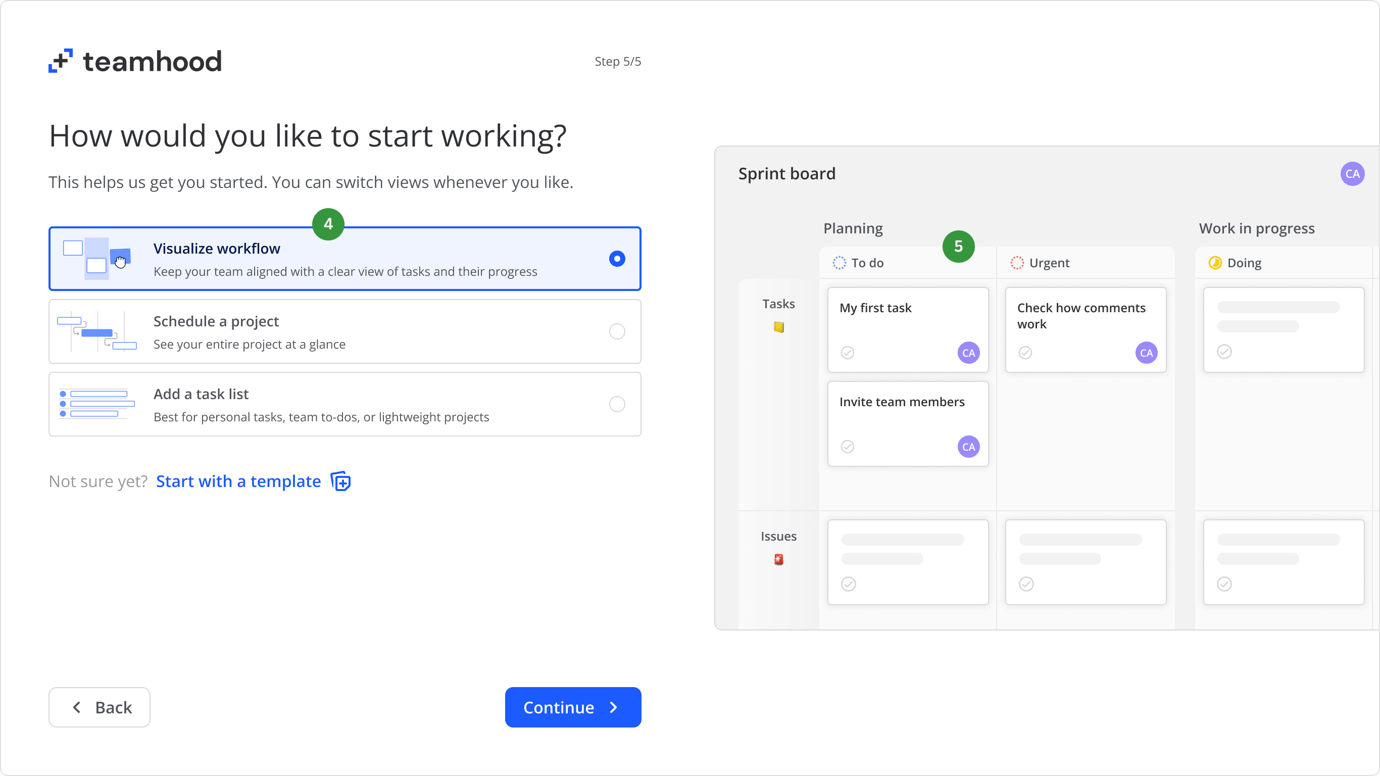
Here is the setup flow that we shipped after a couple iterations:
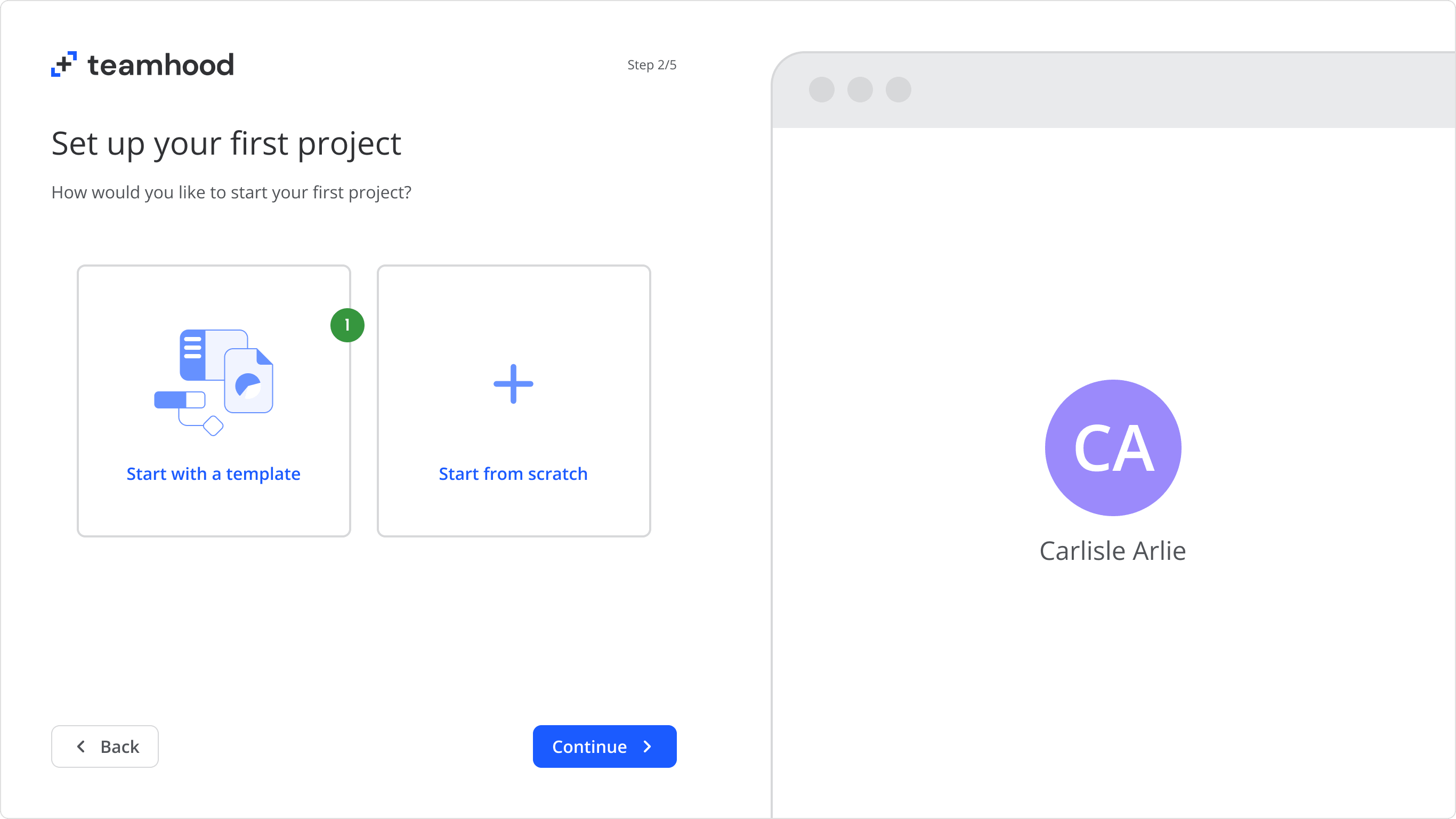
70% of new users preferred to start with a template, so we made this option the first choice.
A question may come to mind: 70% is a lot, why not just focus on the templates? One part of the answer is that previously we simply didn't know how badly users wanted templates. The other part is, I had plans for a nice and well structured template picker, but at the time I was unaware of the Teamhood's bi-weekly release policy, meaning we ship some things in smaller pieces—in this case, a setup flow without a template picker. I was against it, but did not want to mess with the release cycle and policy.
Unsurprisingly, we did not see good results from the stand-alone start from scratch flow. Later, we included the full template library and saw that a big chunk of users chose to start with a template.
There are two lessons here: make sure to compensate when removing something, and don't excessively apply policies to everything.
If the user chose to start from scratch, we let them fall back to templates at any point of the setup, which proved to be very helpful.
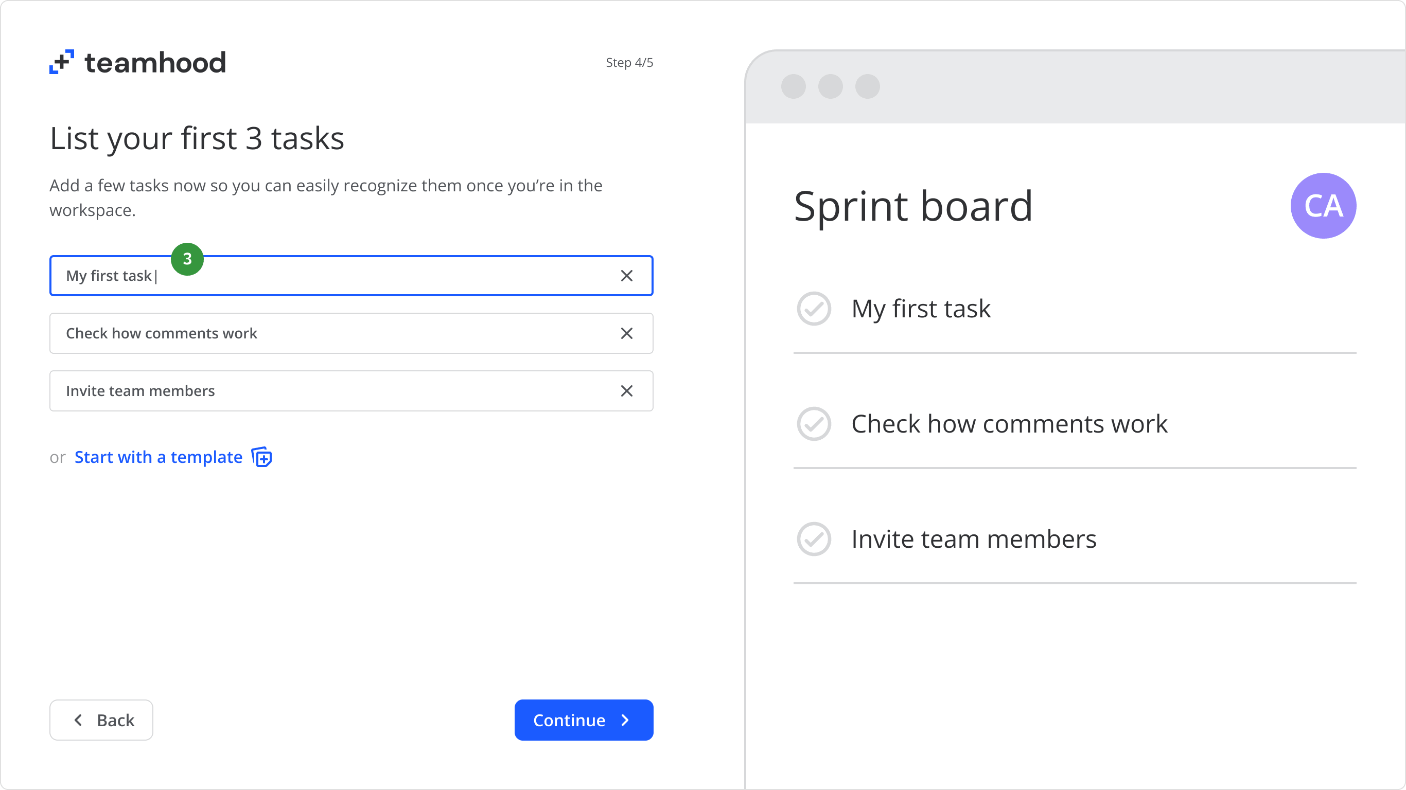
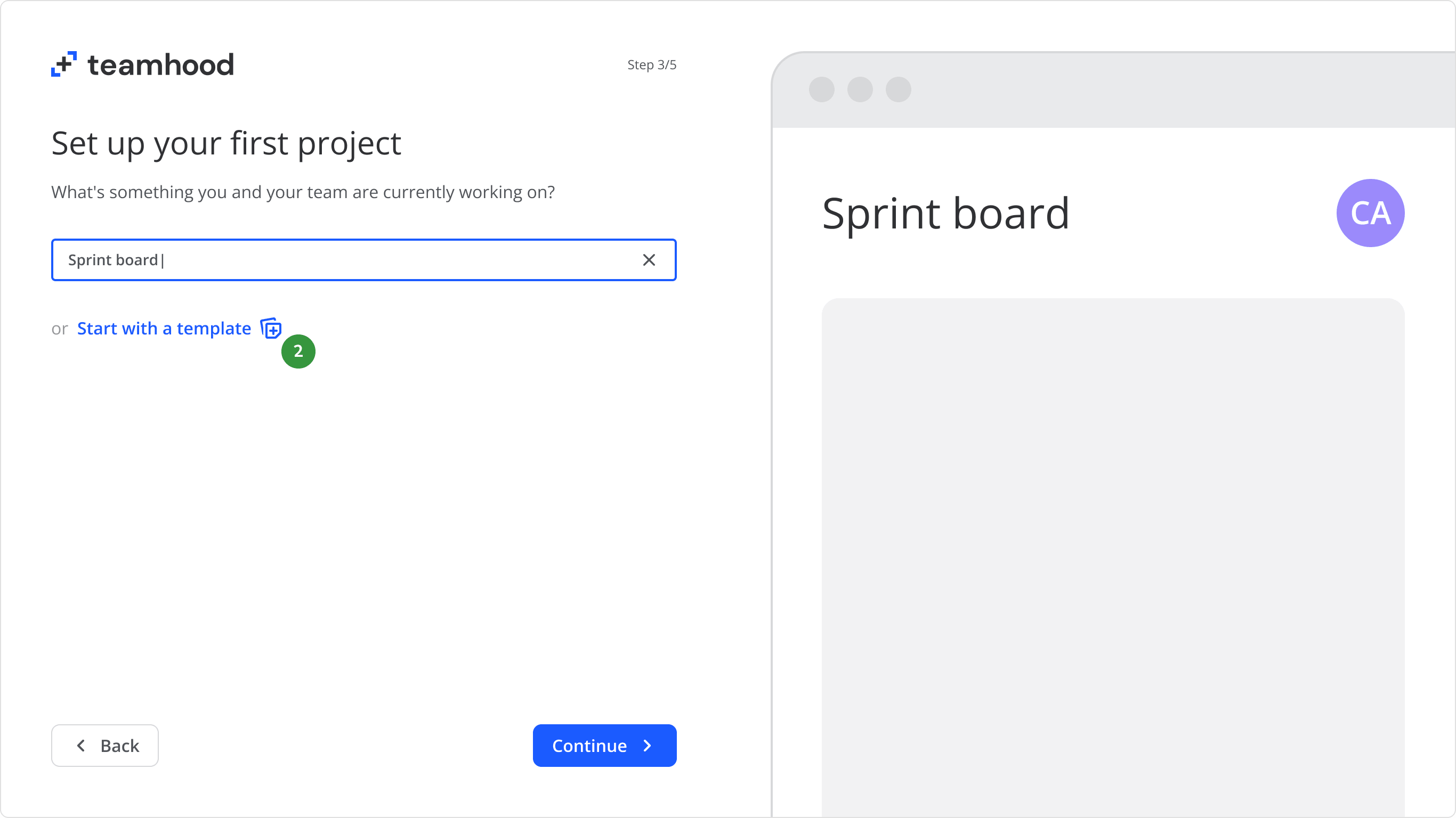
We did not expect users to create actual work content during the setup, but even if it was something trivial as "First task" or "Test task", it was aimed to make it easier for them to recognise these items later.
This is where users got to select their default work view. We reworded the view options to be more distinct, meaningful, and intentional.
We implemented a simplified preview that mimics the actual workspace. Users could decide what suits their workflow better at a glance.
We had simplified previews and adjustments for each work view, but for the sake of keeping it easy to follow, I will be showcasing only the Kanban view.
At this point, the setup is finished, and the user continues in the actual workspace.
We saw more engagement with items immediately after users landed in the workspace. The reason behind this were: A) they recognised their own content, and B) no other items in the same element group were competing for attention.
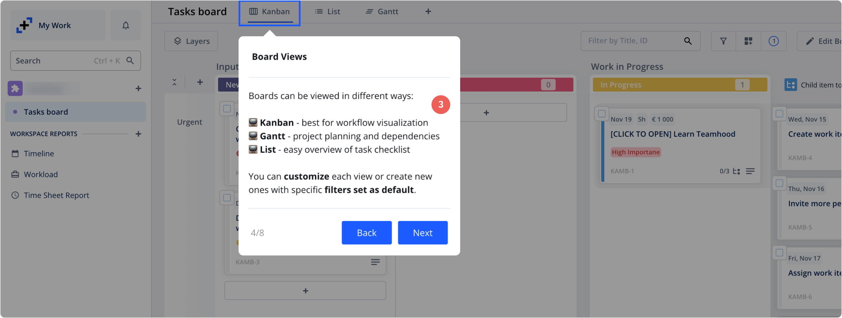
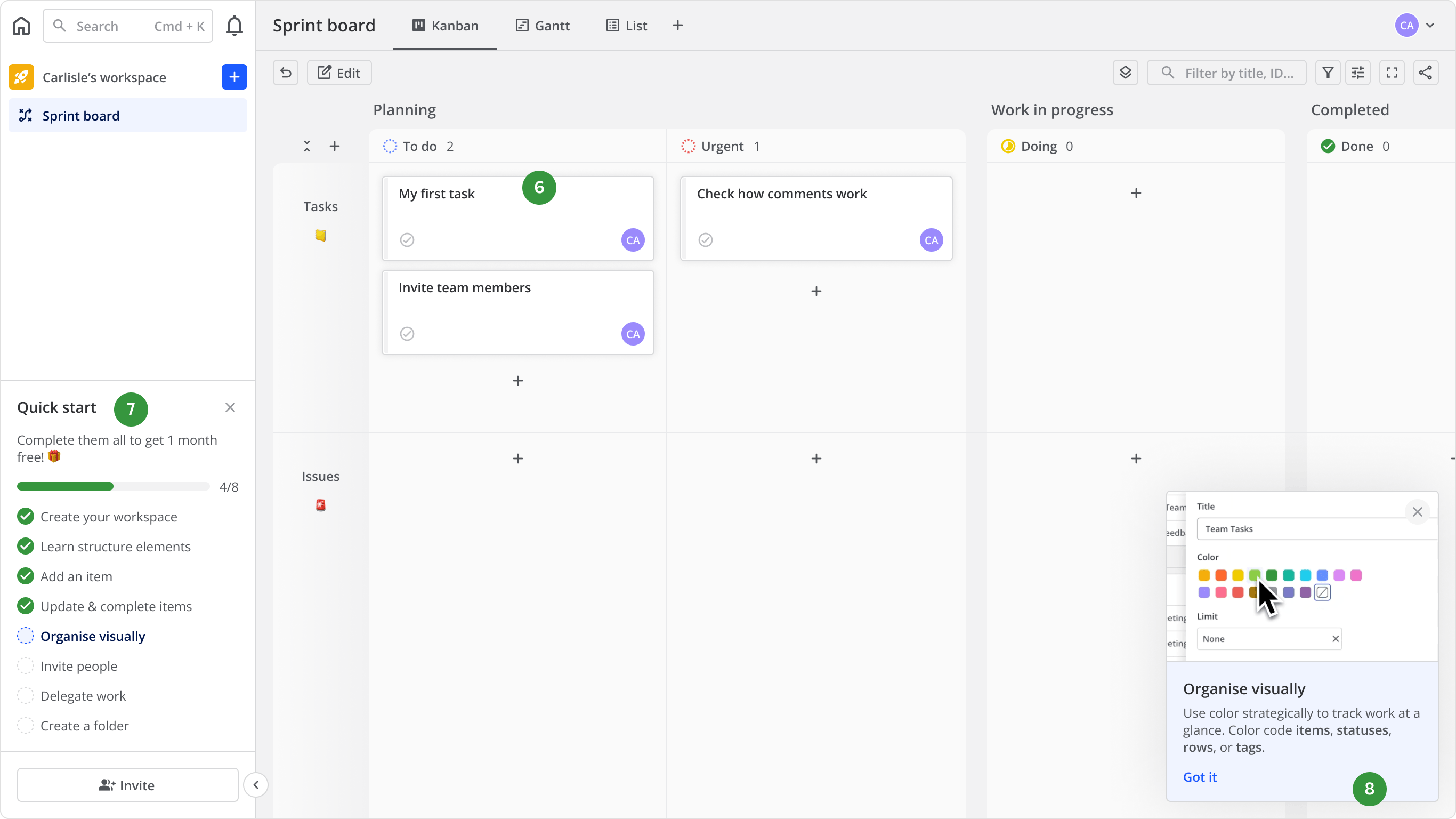
Get familiar with the tool by actually using it—we added Quick start to the sidebar, a checklist of steps encouraging users to discover the core features. I also proposed to add extra motivation by offering a month free upon completion, but there were issues with the accounts & payments part.
We followed up each Quick start step with a video explainer. In some cases, e.g. "Organise visually", users had to navigate the menu in order to color their board. Video explainers helped users discover such important controls.
Session recordings showed that users discovered the core features and important controls much quicker. They also were more keen to explore the board's structure and customizability options.
After shipping the new setup flow with Quick start, we saw more engagement, and it finally felt like new users were no longer splashing around in cold water.
Modern users expect a certain level of guidance because it's already the standard in the tools they use every day. Each user's attention span is limited, and even the most tech-savvy ones can struggle figuring something out. If they don't find whatever they're looking for in time, they'll quit and never look back.
There’s also a bit of a paradox: during competitor analysis, I noticed that most onboarding flows were asking or showing too much too early. If some UI elements constantly get in the user's way when they just want to feel out the product, it could backfire and turn them away. So my pro tip here would be: always look for balance, know your audience, and respect their time.
We saw more users discover the core features and important controls. First user sessions were longer and more meaningful, with less random clicking, more exploration and intentional actions.
As I metioned in the previous chapter, a whopping 70% of new users chose to start with a template. A large library of templates was already present, but most of them were a mess.
Here's an example:
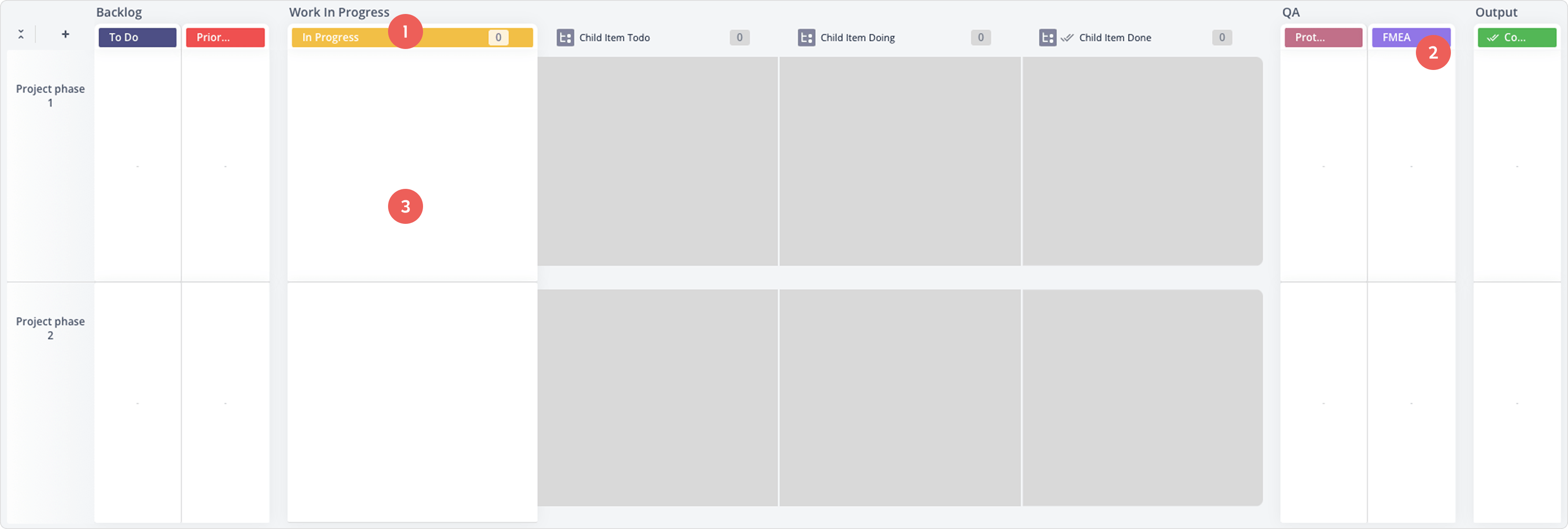
Board structure sometimes didn't make sense or look professional, e.g. "In Progress" status in a "Work In Progress" status group.
Even if it's a niche template, assuming that the user will know what "FMEA" means is risky.
There were no demo work items. Apart from the structure elements, all templates were just a plain empty board.
One of Teamhood's main selling points was a unique and flexible Kanban board structure, but the templates didn't showcase how to make use of it. There was nothing engaging or educational, only a plain empty board that gave the impression, "Here's a board, figure it out."
It's OK to have an empty board for the already experienced user who wants a clean and reusable template for their repeated workflow, but this is not the case. First session experience is where you should strive to inspire users with your product's strengths, functionality, and real-world use cases.
Analytics showed that some templates were barely used. Also, it was quite evident that users were getting lost in the long list of equally dissappointing templates. In design, "Less is more" sometimes is an excessivelly used cliché, but it is completely true in this case: it lets users focus on the right things without overwhelming them (also explained by Hick's Law).
Working closely with the sales and marketing teams, we refined the list. We got it down from 30 to 8 carefully selected templates to target our ideal customer profile. Having a smaller list allowed me to focus on the content and presentability:
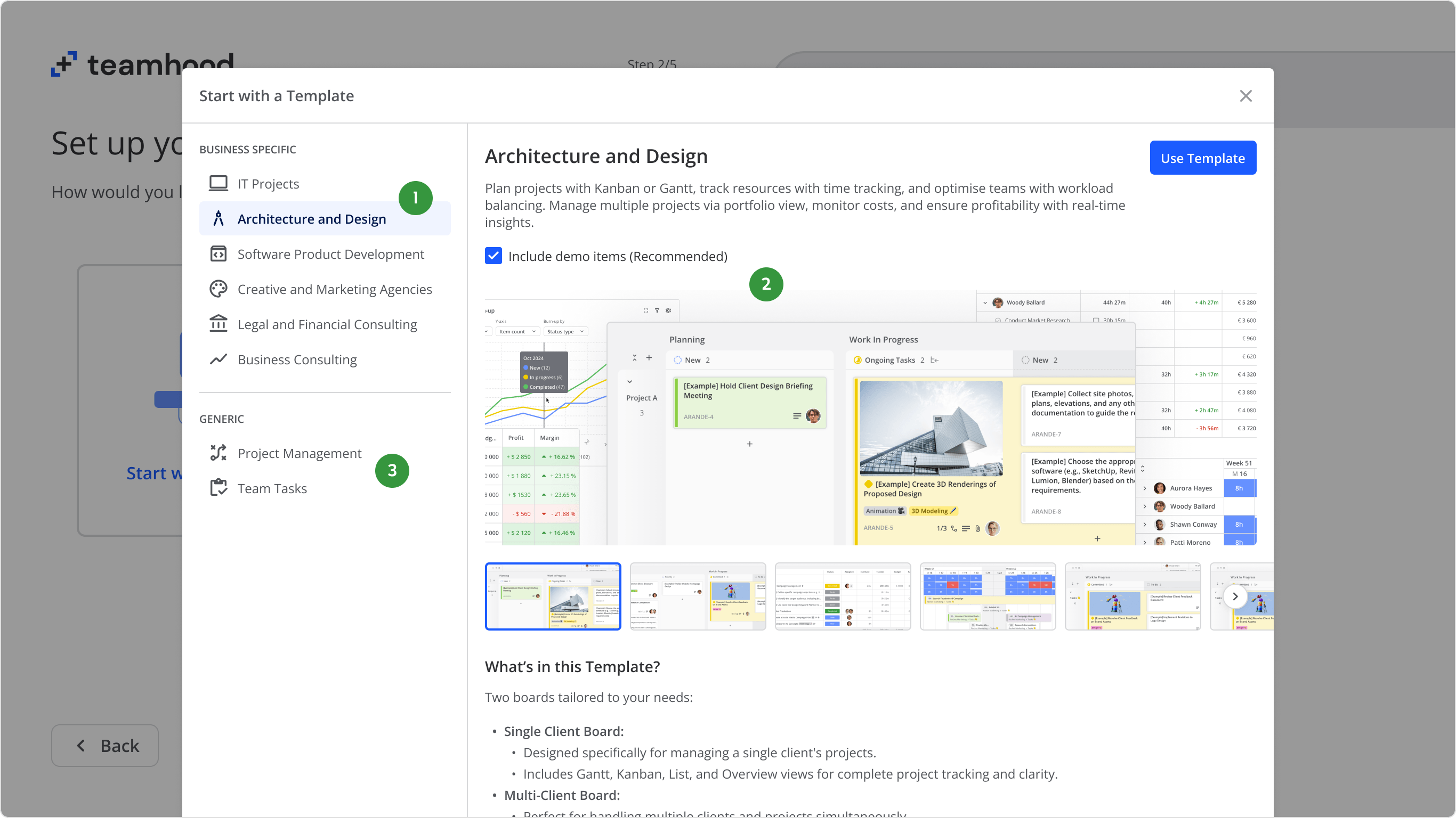
Having a compact list of business specific templates helped users choose the template much quicker.
Showcasing presentable images with description helped users pick the right template.
Some of our loyal customers were not ICP, so we also kept two generic templates for users who don't fit into the business speficic list.
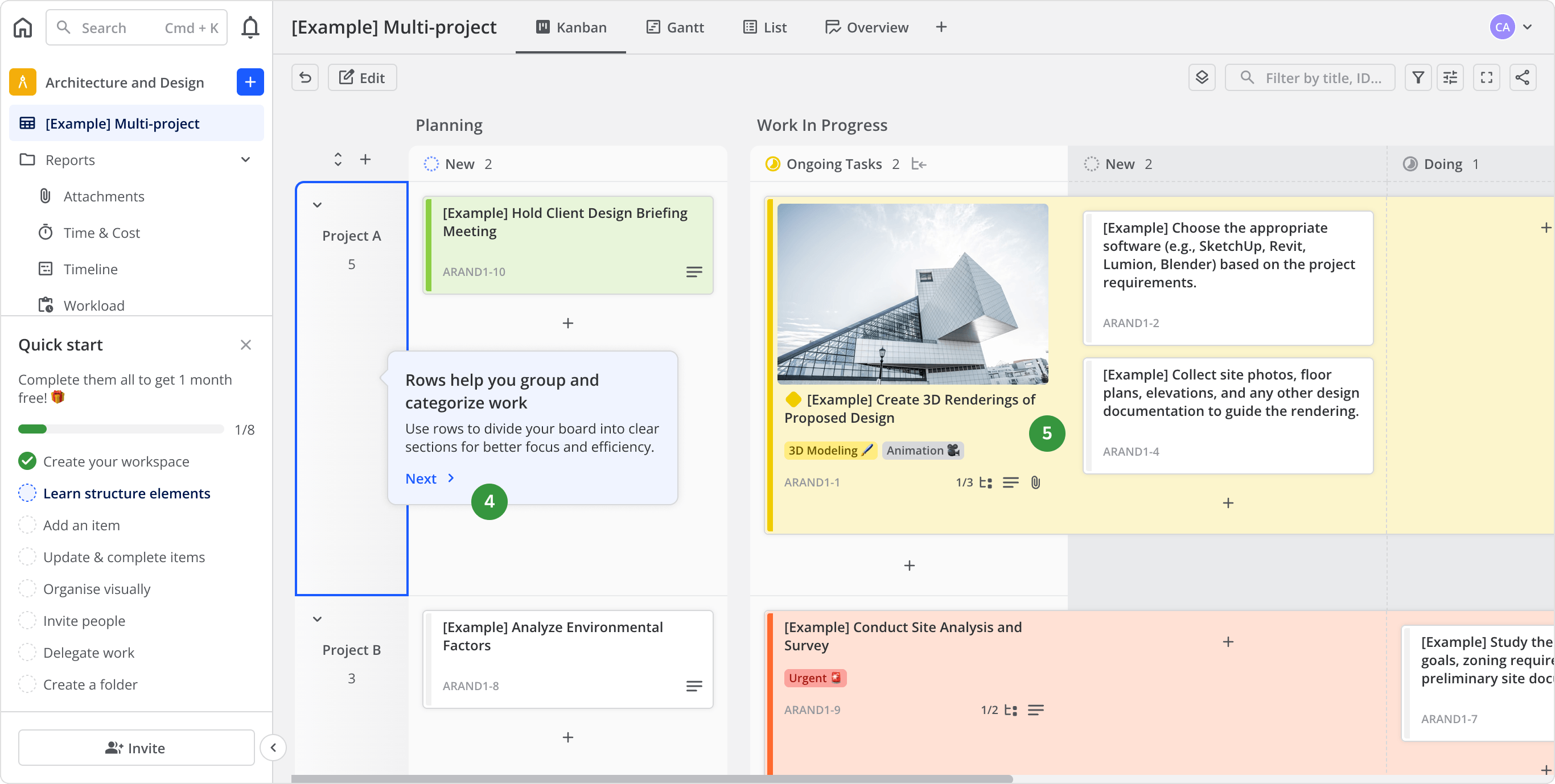
During the walkthrough, it was much easier to present the board's structure having proper context instead of an empty board.
Working together with sales and customer support team (who see user's workflows every day), we managed to create inspiring template content based on real use cases.
I would also like to mention that the static picker and preview was not my first choice; I advocated for the live sneak peek demo (for the website as well), so users could discover the unique selling points without going through the registration. Sounds excessive? I don't think so. Research shows that nowadays people are numb about going through product trials, and rightfully so, because they are fed up with products not living up to what was promised. The earlier you get to show the potential user the real thing (or something close to it), the more chances are they will convert.
Regardless, we went for the static alternative, because the scope of live demo implementation at that time was something that we could not afford.
New users spent much less time clicking through the template list. Their starting template choice also appeared more intentional. We saw more interaction and more user created items appearing alongside the template content.
Were we happy with the activation numbers? Not initially. The product still suffered from feature gaps that we simply didn’t have the capacity to close at the time. Some users couldn’t find the features they were looking for, so naturally, they went elsewhere.
Nevertheless, in nearly two years time, we managed to carve our niche in the market. Our user base grew steadily, and revenue increased by nearly 100%.
Our engineering, marketing, and sales teams grew as well, and so did their efforts, so this wasn't my solo venture. The essential element for growth was the truly user-centric philosophy. We genuinely showed love to our users, and they responded.
The first session activation efforts were only the tip of the iceberg of what I did at Teamhood, but it was the fundamental shift that transformed the product towards user-centricity not only in philosophy, but in the actual UX. This echoed through many parts of Teamhood that we later created and improved.
There is no silver bullet to increase user activation or adoption. It needs to happen organically. If it doesn't—always look into why that is. Your users are not stupid, they only want products worth their time, and they will make the decision with their wallet. Different industries have different tendencies, but with products that are used for work daily, people simply want to get stuff done, and the faster and easier - the better. During the first sessions, big or small things can win or lose users. Make them matter!
I published this case study to share a practical success story about dealing with complex strategic product design challenges in a timely manner. I hope you found it useful, and thank you for reading!
I also want to thank everyone at Teamhood whom I had the pleasure of working with for nearly two years. Thanks to your huge support, I learned how to operate in a truly Lean and Agile environment, navigate complex software design issues, prioritize work strategically, and all of it while having a fun time!